I am trying to implement alternative images at different breakpoints. It doesn’t appear to be available…
Lez
I am trying to implement alternative images at different breakpoints. It doesn’t appear to be available…
Lez
The way I do it is duplicate whatever the image is sitting in, a container, a gallery etc, and then under Layout click on Display Hidden or not for that container/gallery depending on the breakpoint.
I have three image sliders on one project but only one is visible at a time depending on breakpoint. This allows me to play around with the sizing of the controls for the relevant screen size.
I have many photos …. A lot work. @jbyfield
Hi @LEZ
We don’t have a built in way to change an image across breakpoints, at the moment.
The best way to achieve this is to do as @jbyfield says, hide/show different images using the “Hidden” setting.
If you need help setting up this up, or understanding how this works, just let us know 
Hi @ben
A question for my better understanding. I am using also in some cases the hidden value as @jbyfield said.
That means, if I have 5 breakpoints and I am using 5 photos. I would then always hide 4 and show 1. So far so clear.
When the browser loads my page, are then all the 5 photos loaded or only the one which corresponds to my breakpoint? I guess all 5.
I’d honestly recommend adjusting your design so you can use one image for ALL breakpoints. Feels like madness to want different images at each different breakpoint, but that’s just my opinion 
Correct, all 5 would be loaded.
I have worked on sites that needed to supply different images per breakpoint, so I know what the use case would be — but I would say it’s very rare to need to use completely different images.
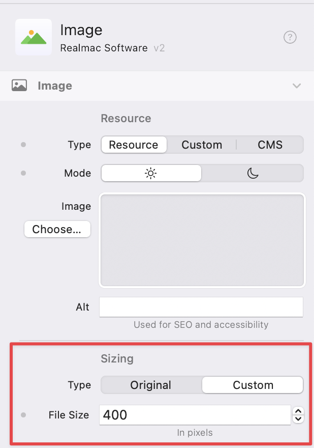
We do support resizing Image’s across breakpoints, so you can re-size the same image for each device.
What about the same image in a grid and using sizing with blue dots? 50%, 70%, 90% …? Google page speed is complaining about too large px photos on mobile. I use 1200x900 or 900x1200. @dan
Thanks @ben for the explanation.
I absolutely agree that the case with the photos would be only a rare case and most probably better solved with re-sizing the photos. I used it only as an example for understanding the “hiding” function. I use it pretty often to show/hide components according to the breakpoint and wanted to understand if it has an impact on the loading speed.
Thanks for clarification!
Thanks. My situation is having images, which are buttons, change at break points, but to different images not enlarging the same image as they do with breakpoints. So how do I get the smaller image to change to the bigger one? LEZ
Hey Dan. The design of this website is a bit different. Shall I upload it to the cloud? It’s nothing fancy, in fact it’s bare bones. I tried suing buttons but I couldn’t get a Google font to work in Elements. So I made it an image…
My friend had started the site in Square Space and I tried to make that work but it’s shite.
Les
Here’s the work so far. elementsapp://downloadDocument/TJ9clFBH8qeA
@LEZ, Okay, I was going to record a quick video… turned into a 15 minute tutorial on “fixing” the site 
Here’s the updated project, that you can  Open in Elements.
And here’s the video of me rambling on and explaining how I’d build the site, and how to get Google fonts working  Hope you find it useful…
P.S. I agree about SquareSpace being shite
Dan - you’re the man! I really appreciate this and will pore over this video and the project later.
Thanks hermano. LZ
Dan, can you email me so that I have your address? Want to send a small gift. leshall@gmail.com
Cheers Lez