Hello folks I am wondering if anyone can please help. I have this layout of three photos in a grid with some text under them. I want it to scale to any screen size. Currently when it is viewed in mobile, the individual photos/ cells of the grid, become the width of the page. I really need to make the whole table scale with the text when it is on mobile. So that the three photos are side by side and not under each other.
Any help is kindly appreciated. I am at my wits end with this. Thank you
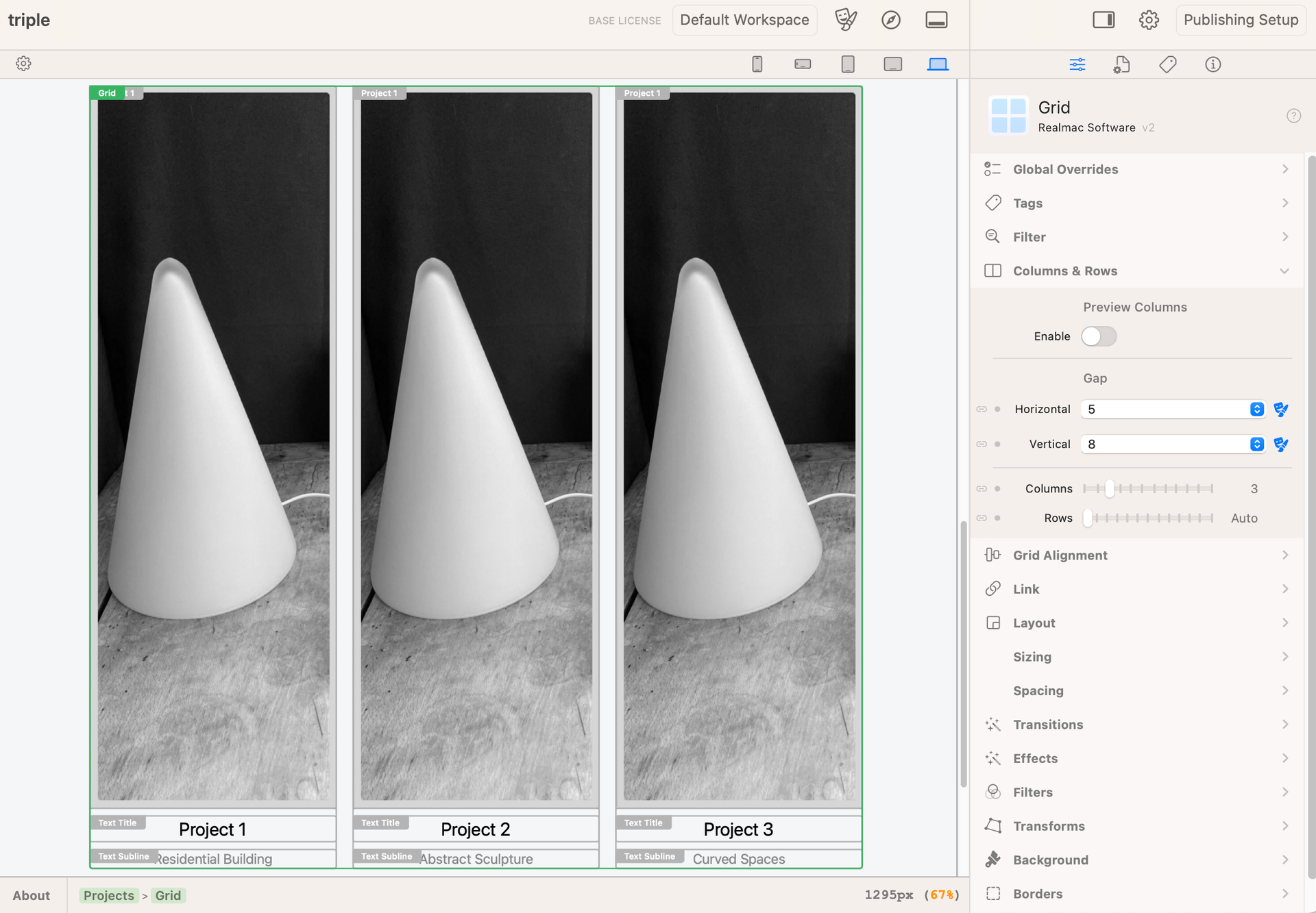
Make sure when you are on the smallest preview that the columns are set to 3 and not 1. Did you override the number of columns on any of the larger screen sizes?
Thank you Edward for your help, this fixed it but now I am trying to work out how to make the text boxes either small or only as deep as the text inside of them, they are too long. Can you please help. Thank you.
Would you be able to upload your project to Elements Cloud? That way, we can take a look a the project and show you how to get the result you’re after!


