Pegasus
June 28, 2025, 11:44am
1
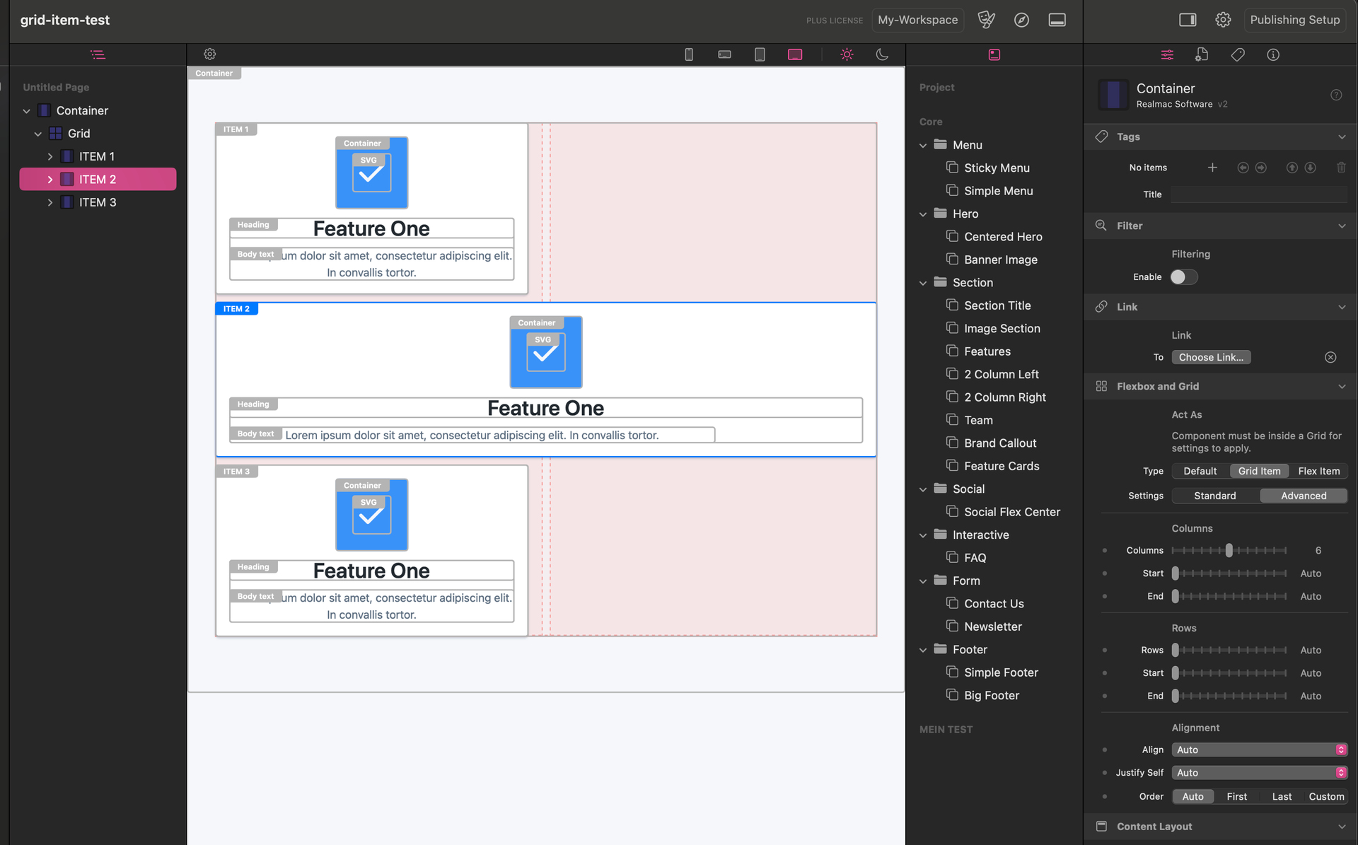
I would like to build a grid that looks like this.
+---------+------------+
|  Item 1   |          |
|-----------|  Item 2  |
|  Item 3   |          |
+---------+------------+
i’ve already asked the elementsbot. but that wasn’t much help to me.
i know how to set the “item 2” to 100% for a row. But I don’t know how to set the 100% for column.
here is the link to the project. Does anyone have an idea where the issue is?
upssjw
June 28, 2025, 11:54am
2
this a one way, needs work not sure what your end state is
upssjw
June 28, 2025, 11:54am
3
just saw you added project
upssjw
June 28, 2025, 12:01pm
4
@Pegasus I just adjusted you file with a couple of tweaks
is this what you are after, either one or different
Pegasus
June 28, 2025, 12:05pm
5
@upssjw the first one. that’s exactly what i want. how did you manage that? what setting did i see above? can you share the project?
many thanks!
upssjw
June 28, 2025, 12:12pm
6
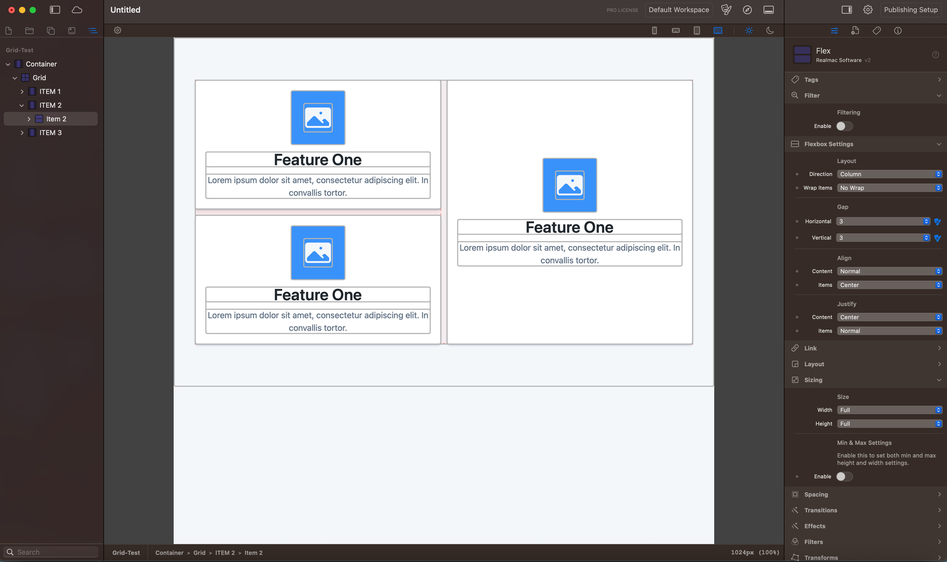
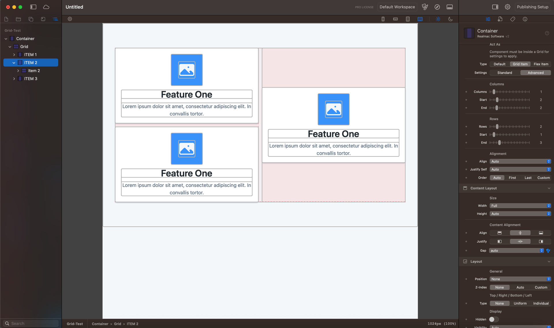
@Pegasus
ok I adjusted item 2 container to grid then changed the col row positions, changed content layout height to full
then changed the flex sizing height to full
if you change these you can see the different outcomes
elementsapp://downloadDocument/6sChYhDL4DiB
try changing the col row settings to see position
you can leave the col and row top setting to auto I just like to know what is set
Pegasus
June 28, 2025, 12:20pm
7
… ok I got it!
Content-Layout/:Height —> Full
i missed that.
thank you for your help
Pegasus
June 28, 2025, 12:48pm
8
@upssjw you already look like a pro with rw-elements to me. more than the elementsbot ^^ do you have any tips on how to get all columns in a row in the mobile-view?
when i try it the layout breaks :-/
upssjw
June 28, 2025, 12:53pm
9
elementsapp://downloadDocument/eKrrwjkjxnBC
I liked the layout converted to responsive
not sure what you mean by in all columns in a row, opposite of this?
might need max width for larger screens or set container
more than one way to do this
upssjw
June 28, 2025, 1:09pm
10
@Pegasus
responsive has issues both ways, larger screen will stretch your layout, if you set Elements as is probably not a problem, if you add larger screens?
so just my thoughts
see video
dan
June 28, 2025, 1:49pm
11
@Pegasus @upssjw ,
You guys seemed to have worked it out… However, I couldn’t resist doing a quick video to talk through settings this up. Others might find it helpful (and I should really do a proper video on this for the manual). Anywhere, here it is…
Open Project in Elements
upssjw
June 28, 2025, 1:55pm
12
nice, I said there was more that one way, just flex is another way
Mine was pretty much exactly the same but I like using the advanced controls
Pegasus
June 28, 2025, 6:06pm
13
a big thank you @dan . the video was very helpful. such things as a somewhat special grid are different from rw + foundry3.
this should make it easier to create grids in elements in the future.
upssjw
June 28, 2025, 6:28pm
14
once you practice you can create what I think are simple Bento layouts, minutes to create, more time to fill with content of course
Elements makes this easy, with all components having all the controls built in, simples
