@dan@ben Can you elaborate on this setting please.
I believe it creates an actual copy image at those pixel dimensions from the supplied image?
If that’s correct, when?
The moment you change that setting?
At preview time?
At publish time?
What is the compression like?
none?
Good, maybe proprietary Squash code?
I’m trying to understand (being the lazy web developer I am), can I drop round tripping through other apps if I want to use a 1024px image in the page at say 128px, and just drop the 1024px image in the Image component and set the file size to 128.
Upsides, seem good if its saving round tripping through other apps.
Downsides, if it’s having to do that work at preview or publish time.
EDIT: Another possible downside that sprung to mind. I guess it retains the origonal in the project file as well? So project file bloat, if I just throw every image in way bigger than needed throughout the project and rely on that setting to save me?
It’s pretty good, it’s probably not going to beat a dedicated app as you can’t tweak the settings, but it’s much better than nothing. We do have more work we want to do on image resizing, so plan to revisit it at some stage… got a few big things to finish first!
I don’t really see a downside here, we do it on the fly and it’s fast so shouldn’t impact your workflow. If you had tonnes of HUGE images then it might be a problem, but I’ve never see it be an issue…
Disk space is cheap and plentiful these days so you really shouldn’t worry about your projects being too big.
Personally, I generally resize my images before I add them into Elements. Not always, and as long as the file isn’t too big, I just go with it
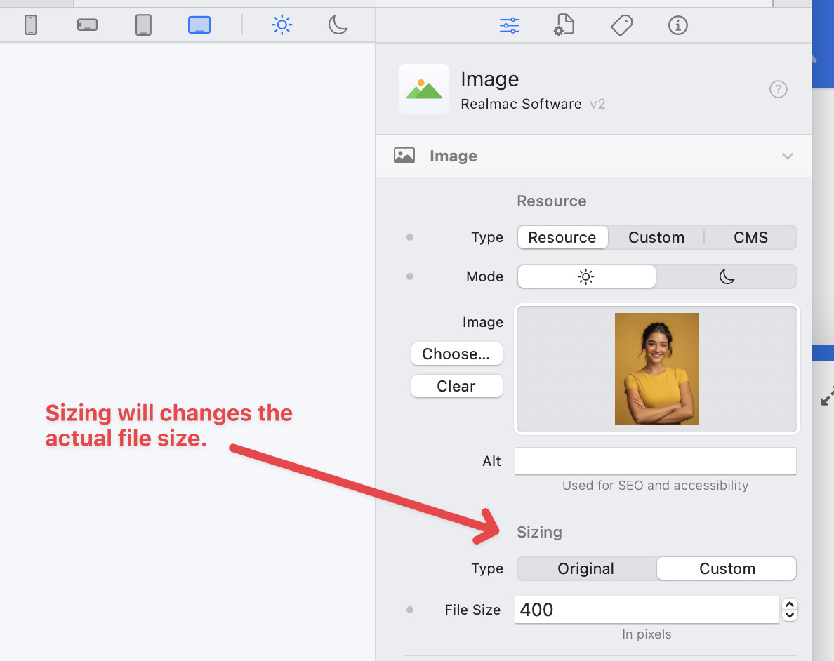
I’m a little confused about the file size setting. What units may be used? Always pixels? It seems like when I change the setting, the image in the edit window stays the same size. A low setting makes the image blurry.
To change the display size on the page (but leave the physical size of the file) you can use the size settings under the Sizing Tab. You can use any CSS sizing units here.
I still don’t understand why this label hasn’t been changed to “Resolution”, since that’s effectively what it’s doing (which is why, Carl, the image stays the same size but gets blurry when you set it low). That would make more sense for the units (pixels) being used too.
Right. Having two things called Sizing is asking for customer support ;~). One is logical size, one is physical size, and as people keep finding out, that’s pretty important to understand.
Many thanks. At my current shallow understanding, I’m in a phase where changing parameters often does nothing. I’m sure that’s because I don’t understand the interactions between settings.
For example, here’s a discovery this morning after reading your post.
Open a new project and drag an image object into it. Drag a jpeg into the Resource section in the image properties. Cool, you have an image.
Scroll down to the Size section. The width parameter scales the image, both height and width. The height parameter sets the vertical span the image block takes up on the screen.
Ok, set the width to 50%. Height and width of the image are scaled to 50%.
Set the height to 50% and nothing will happen to the image, but the lower boundary of the image object will scoot up, appearing halfway down the image.
Set the z-index of the image to something high and add something else after (below) the image. The new object will be overlaid by the bottom half of the image.
Width is image scaling as seen from the horizontal axis. Height has to do with layout, and nothing to do with image size.
It’s with noting if you ask for the image at say 512 you get a 1024px image on hi-density screens. Can’t check what you get on old 1:1 screens as I don’t have one.
I need to add a video to demonstrate how to use a lot of the options, but the Image Component page in the manual now has a lot more detail.
Hopefully you’ll find it useful and will help avoid any future confusion. Please let me know if you’d like me to expand on any areas within the Image Component Docs.


