I’ve just finished building my website on Elements. Although I was initially hesitant, I must say that the process has been very smooth and enjoyable.
I work on a Mac, but have an Android phone. After publishing my site, everything looked perfect on the desktop. However, on my Android phone, the site only displays at about half the screen width in portrait mode. I spent over an hour trying to adjust it before thinking to test it on an iPhone. And to my surprise, on iPhone, everything appears perfectly. But interesting to note that when I rotate my Android to landscape, the display is also fine.
I wanted to bring this to the developers’ attention, as it may be an issue worth investigating. I’m not sure if there’s anything that can be done on my end, as all looks perfect on an iPhone.
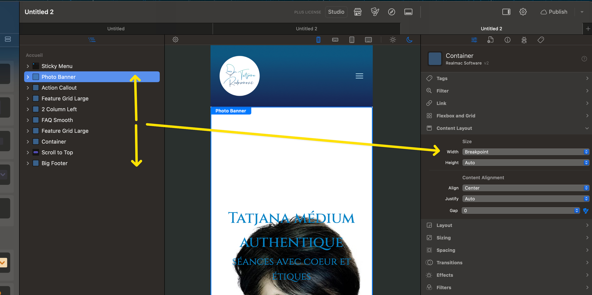
I’ve run a lot of tests on both Windows and Android devices, and the only problem I’ve encountered (even in older versions of Safari iOS) is that, if there are nested elements where there’s no consistency in the (auto or full as well) vertical space, the vertical space doubles, moving the elements downward (and therefore they disappear).
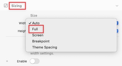
I am willing to try again, but I’ve tried full and auto and published every time to realize it remained the same on android and then found out it was okay on iPhone.
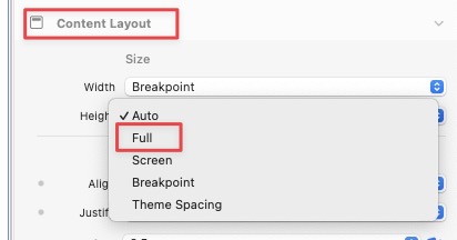
I changed the content layout as well as each element, as I thought that I must have changed something inadvertently with the width, until it dawned on me, that it might be the type of phone I am using.
Maybe worthwhile to note, I use Firefox, but have not tried on another browser yet.
not looked at your project just opened Firefox with your site and the Elements site, no float on Elements site but yours has quite a bit of float, width setting somewhere, @Doobox has pointed to some, back to football