Is it possible to set different Visible Slides for mobile, tablet, desktop etc?
Using a Container or Flex or … ? @dan
Is it possible to set different Visible Slides for mobile, tablet, desktop etc?
Using a Container or Flex or … ? @dan
like this
Something like that. Are you dropping the same photos 4 times in the Image Sliders?
you can or drop different folder in
so you could customise each slider
That’s interesting, since vertical photos are good on mobile and horizontal often are better on desktop.
they are different images sliders, so you can change them to suit, they are just hidden on different screen sizes
I have done this with Columns in Grid. The larger screen, the more Columns. For mobile 1-2 Columns.
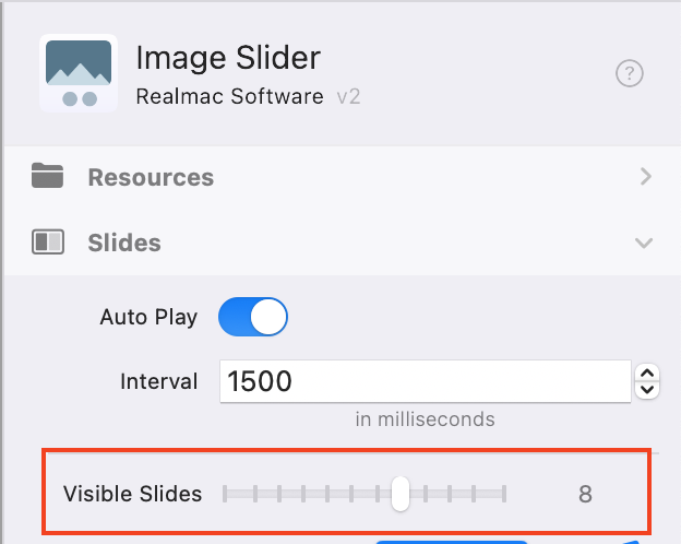
Grey/blue dots would be useful in Image Slider: Visible Slides … @ben
Yeah that’s how I was expecting it to work when I used the Elements slider, not shrink as they are doing in mine. Thanks for taking the time to answer.
With the way the Image Slider is currently setup it’s not possible to make that control responsive.
I know a few people are asking for this so I’ll add it to our list.
We have a lot of important and exciting things in the works right now, so I’m not going to be able to prioritise this at the moment, but it is something we would like to add in the future 