Hey all,
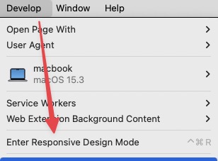
Is there a way to have a landscape mode for mobile in Elements? When editing it as mobile, i only see it in portrait mode but not in landscape.
Greetings,
Mike
Hey Hans,
Thanks for replying, but unfortunately adjusting the screen size for landscape doesn’t give me the landscape look for editing >.<
Even the chatty bot can’t help me 
Greetings,
Mike
Hi @MikeV
getting a portrait mode in Elements edit is as far as I know only possible if you select the portrait mode (as you already did) and then make the whole Elements window smaller in height. Then you get an idea how it looks, but it’s not optimal for working any more.
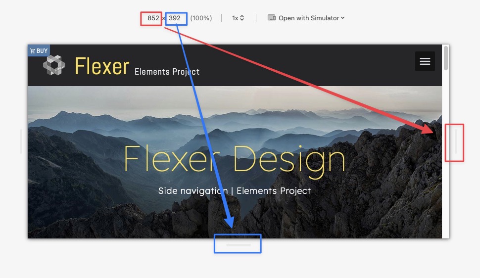
What I am doing as a workaround, I use the App Responsively
It shows some views of your preview page. You can set it to iPhone in portrait mode and then you have a clear idea if what you create is good on small screens.
Try it it is free until you decide to sponsor them.
…“editing in”…, so there is no Safari or other webbrowser involved yet!?
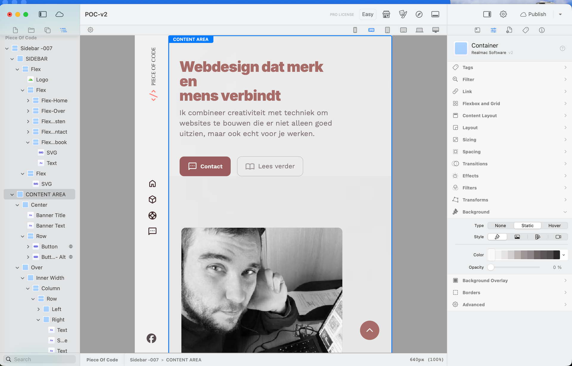
By setting the responsive breakpoint SM, you should get a landscape smartphone view and here you can set all your other parameters for this screen size (line breaks, font sizes etc,) within Elements so that you get your desired landscape look.
Testing for finetuning can and should be on popular mobile devices then via Preview.
@WeaverPixel s suggestion with ResponsivelyApp might help you trying out different screen widths within a webrowser on your Mac.
However Markus should be the real expert here!
ohh wauw! This app is a game changer!
Thanks a lot for helping me out peeps! <3
Greetings,
Mike