I just checked YouTube. It’s super easy to choose NOT to show “suggested videos” when embedding. See attached screenshot. (You also have nice choices about other things such as size, player controls, etc.
)
Got the file, thanks… your source for the video is incorrect
You are using (which is bad code):
`
Add your MP4 file into the RapidWeaver Resources
In the BODY of the BLOG entry (NOT the SUMMARY) add this code:
<video src="%resource(THG-missedput.mp4)%" type="video/mp4" width="auto" controls></video>
Select this same code
Then Select Format -> Clear Formatting
Then Select Format -> Ignore Formatting
The ONLY issue you will encounter is that because you are using a fixed width Theme, the video will not be viewable entire width, so you’re gonna have to modify the width and height of the video and test it to get it to display as wide screen. Maybe 640x360… nope, width=600 and leave height out and you get all the controls and no autoplay. if you use…
<iframe src="%resource(THG-missedput.mp4)%" type="video/mp4" width="600" controls></iframe>
Then it will autoplay when page is viewed.
HTH
Brad
When you use this code, you have the video responsive. Works only with width 100%, not height.
<video src="%resource(your_video.m4v)%" width='100%' controls> Your browser can not play this video. </video>
1 Like
Darn it, forgot about that… nice addition too for the unable to play message!
Can also add autoplay=1 to have the video autoplay… as in:
<video src="%resource(THG-missedput.mp4)%" width='100%' controls autoplay=1>Your browser can not play this video.</video>
Brad
1 Like
Hello Brad
I don’t like “autoplay” of videos and audio files 
You can write only autoplay, =1 is not necessary.
I prefer also, adding the video in resources.
… and I can choose the 100% width, using a column stack.
1 Like
Thanks again Brad.
I tried the final code ie iframe and no joy.
Do I need to use both sets of code? ie video code.
In other words is it an either/or?
Thanks Brad Oscar and Mathew.
You have restored my faith in RW.
I ended up with the Resources solution because I couldn’t get youtube to behave.
And the videos are really short.
NOW my other original problem is with responsive nature of the heading. It doesn’t so I will do the url text thing again and have you point out the errors of my code if you don’t mind.
Cheerio and TIA
John
Dropbox ref
The header of what? The blog entry Summary or Body?
You will likely have to use a custom style on that page to change the value of the header class to rem from px (this will allow the content to resize based on device instead of being fixed).
But, your shared html file is a blank page except for navigation so not sure what you’re asking help with
Brad
Brad
Don’t you sleep at night!
If you resize that page for iphone the header does not resize.
I wasn’t referring to the blog page but actually all pages.
1 Like
@hildaxe Sometimes, sometimes not… lol
If you’re talking in RapidWeaver preview Mode, that does NOT give you a true representation of scaled data to the iPhone!
Unfortunately, some Third Party Themes that come with, or are part of the RapidWeaver Pro-Pack of Themes (Looks like this is no longer sold unless it is farther on in the purchasing process) are out-dated and not maintained (updated) and are there to provide a sample of what could be. It is always suggested that if you like the thought of the Theme to go buy the Pro version from the developer in question, that way you get updates, fixes and tech support from the person that made it.
Examples of this are Allegro, Tesla, etc…
I would suggest you upgrade to Allegro Pro making sure to visit the site on a mobile phone and if need be, Contact Brandon Lee directly 
Not much help
But that’s the best I can do
Brad
With this additional < div align … > code, you can set your video center.
<div align="center"><video src="%resource(your_video.m4v)%" width='100%' controls> Your browser can not play this video. </video></div>
I would prefer, to copy the video in a 3 columns stack, in the middle. Now you can play with the first and the third column width. Put there a spacer stack, otherwise center (second column) do not work in a 3 column stack.
Yes, the header title is not responsive, unfortunately!
Perhaps, you choose another logo position?!

Now, I have a break in the title and a smaller logo.
So you can see the whole title on a iPhone.
In the CSS you can put this code for the right position.
a#logo img {margin-top: 60px;}
Trying<br />Hard at Golf

This smaller logo you can download.

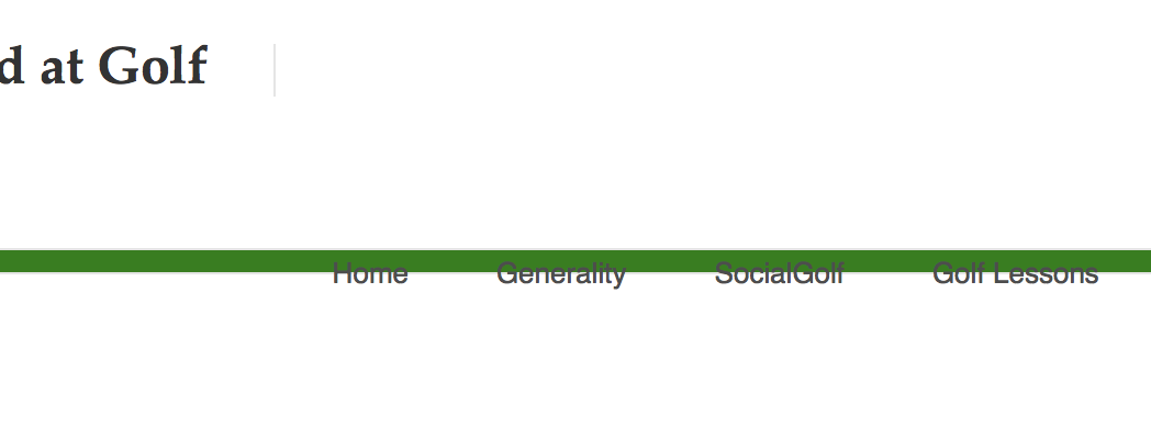
There’s an error in your navigation.
If I resize the browser window, we see the navigation on two different places, before the smartphone navigation appears. But I don’t know why!

Oscar
Yes it’s woking as responsive now. i broke the title up to 3 lines so they sit on top of each other.
BUT i cannot get the title to go closer to the top.
I tried this with no result.
h1#title{
margin-top:10px;
}
My problem is learning how to specify the elements of the code. Any ideas where to learn?
Cheerio
John
I highly recommend this book. Easy to read and very clear. (no affiliate link btw)
http://www.amazon.com/HTML-CSS-Design-Build-Websites/dp/1118008189/ref=pd_sim_14_3?ie=UTF8&dpID=41K27gRbYmL&dpSrc=sims&preST=AC_UL160_SR127%2C160&refRID=1V6FDMVM2558G3DQ4NE7
1 Like
Thanks LaPan.
I will look for the title.
@hildaxe
Use this code to get closer to the top, change the values.
a#logo img { margin-top: 20px; }
header h1#title { margin-top: 20px; }

@hildaxe
Read this thread. Enable the developers tools in RW and in Safari (or other browsers), so you can see the code of every website.

I have seen in this theme, when the title is too long, or there are more than 3 menus, appears a fault in the navigation. The navigation jump down and displaces the slogan. That’s bad.
