Hello,
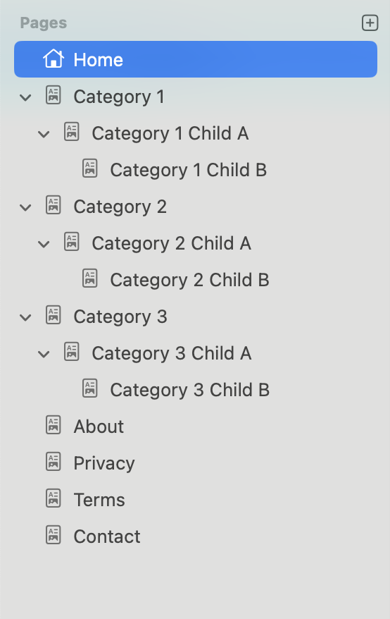
I am putting together a website that has four tiers:
-
Tier 1: Home
-
Tier 2: Categories
-
Tier 3: Main Articles
-
Tier 4: Supporting/Detail Articles
The website is primarily informational, with several hundred pages or more. Its structure follows a Pyramid styled Silo layout.
I’d like to display the Tier 1 and Tier 2 pages across the top menu bar and hide all other tiers. In the tree navigation, I only want to show the Tier 3 and Tier 4 menus for the active silo (that is, the related pages).
Does anyone know a way to do this without manually curating the menus?
AI suggested a custom component:
<div class="relative">
  <!-- Mobile Toggle -->
  <button
    id="mobileSidebarToggle"
    class="md:hidden flex items-center gap-2 bg-gray-100 dark:bg-gray-800 border border-gray-300 dark:border-gray-700 px-3 py-2 rounded-lg mb-3 z-50 relative text-gray-800 dark:text-gray-100"
    aria-label="Toggle sidebar"
  >
    ☰ <span>Categories</span>
  </button>

  <!-- Overlay -->
  <div
    id="sidebarOverlay"
    class="fixed inset-0 bg-black/40 opacity-0 pointer-events-none transition-opacity duration-300 md:hidden">
  </div>

  <!-- Sidebar -->
  <nav
    id="sidebarTree"
    class="sidebar fixed md:static left-0 top-0 bg-white dark:bg-gray-900 md:bg-transparent h-full md:h-auto w-64 md:w-60 border-r border-gray-200 dark:border-gray-700 shadow-lg md:shadow-none transform -translate-x-full md:translate-x-0 transition-transform duration-300 ease-in-out z-50 p-4 overflow-y-auto">

    {% assign currentCategory = currentPage.parent %}
    {% if currentCategory %}
      <h3 class="text-lg font-semibold mb-2 text-gray-700 dark:text-gray-200">{{ currentCategory.title }}</h3>
      <ul class="space-y-1">
        {% for page in currentCategory.children %}
          {% if page.isVisible %}
            <li class="{% if page == currentPage or page.isAncestorOf(currentPage) %}bg-gray-50 dark:bg-gray-800 rounded-md{% endif %}">

              {% if page.children.size > 0 %}
                <button
                  class="toggle flex items-center w-full text-left text-gray-700 dark:text-gray-200 px-2 py-1 rounded hover:bg-gray-100 dark:hover:bg-gray-800 transition"
                  aria-label="Expand section">
                  <span class="mr-2 text-sm font-bold select-none">+</span>
                  <span>{{ page.title }}</span>
                </button>
              {% else %}
                <a href="{{ page.url }}"
                   class="block px-2 py-1 text-gray-700 dark:text-gray-300 hover:bg-gray-100 dark:hover:bg-gray-800 rounded transition nav-link relative {% if page == currentPage %}font-semibold text-gray-900 dark:text-white before:absolute before:left-0 before:top-0 before:h-full before:w-1 before:bg-blue-500 before:rounded-r{% endif %}">
                   {{ page.title }}
                </a>
              {% endif %}

              {% if page.children.size > 0 %}
                <ul class="nested max-h-0 overflow-hidden transition-all duration-300 ease-in-out pl-4 border-l border-gray-100 dark:border-gray-800 {% if page.isAncestorOf(currentPage) %}expanded max-h-screen{% endif %}">
                  {% for child in page.children %}
                    {% if child.isVisible %}
                      <li>
                        <a href="{{ child.url }}"
                           class="block px-2 py-1 text-gray-600 dark:text-gray-400 hover:bg-gray-50 dark:hover:bg-gray-800 rounded transition nav-link relative {% if child == currentPage %}font-semibold text-gray-900 dark:text-white before:absolute before:left-0 before:top-0 before:h-full before:w-1 before:bg-blue-500 before:rounded-r{% endif %}">
                           {{ child.title }}
                        </a>
                      </li>
                    {% endif %}
                  {% endfor %}
                </ul>
              {% endif %}
            </li>
          {% endif %}
        {% endfor %}
      </ul>
    {% endif %}
  </nav>
</div>

<script>
document.addEventListener('DOMContentLoaded', () => {
  const toggles = document.querySelectorAll('.toggle');
  const mobileBtn = document.getElementById('mobileSidebarToggle');
  const sidebar = document.getElementById('sidebarTree');
  const overlay = document.getElementById('sidebarOverlay');
  const links = document.querySelectorAll('.nav-link');

  // Expand/Collapse for Tier 3 → Tier 4
  toggles.forEach(btn => {
    const nested = btn.parentElement.querySelector('.nested');
    const icon = btn.querySelector('span:first-child');
    if (nested?.classList.contains('expanded')) {
      nested.style.maxHeight = nested.scrollHeight + 'px';
      icon.textContent = '−';
    }
    btn.addEventListener('click', () => {
      if (!nested) return;
      if (nested.classList.contains('expanded')) {
        nested.classList.remove('expanded');
        nested.style.maxHeight = 0;
        icon.textContent = '+';
      } else {
        nested.classList.add('expanded');
        nested.style.maxHeight = nested.scrollHeight + 'px';
        icon.textContent = '−';
      }
    });
  });

  // Sidebar open/close
  const openSidebar = () => {
    sidebar.classList.remove('-translate-x-full');
    sidebar.classList.add('translate-x-0');
    overlay.classList.remove('opacity-0', 'pointer-events-none');
    document.body.classList.add('overflow-hidden');
  };

  const closeSidebar = () => {
    sidebar.classList.add('-translate-x-full');
    sidebar.classList.remove('translate-x-0');
    overlay.classList.add('opacity-0', 'pointer-events-none');
    document.body.classList.remove('overflow-hidden');
  };

  mobileBtn.addEventListener('click', () => {
    if (sidebar.classList.contains('-translate-x-full')) {
      openSidebar();
    } else {
      closeSidebar();
    }
  });

  overlay.addEventListener('click', closeSidebar);

  // Auto-close on link click (mobile)
  links.forEach(link => link.addEventListener('click', () => {
    if (window.innerWidth < 768) closeSidebar();
  }));
});
</script>
