The CSS Grid options we support in the V2 components are pretty advanced, more so than anything else I’ve seen on the Mac.
Here’s something I was working on using the new v2 components… is this the kind of offset stuff you wanted? (we also support assigning a custom order to grid items at different breakpoints).
We could add this in a later version, however, I think designing grids with template areas would require some form of separate visual editor for creating template areas.
Basically I think it needs more thought and to be done properly from the get go, and that won’t make it in to v1.0.
You can achieve overlapping grid items with the current set of components - we support start and end lines for both columns and rows.
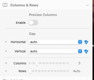
We also have support for margins and translate x and y, so you have the flexibility to move things around in ways that make sense for the design you’re working on
Thanks for your reply @bon. I tried to achieve exactly that but didn’t succeed. Using start and end lines for both columns and rows doesn’t give me overlapping grid items like I thought it would. Every other item in the grid just moves. Maybe I’m too tired or it’s too late, but I didn’t find a way to have grid items overlap that way.
Im not sure that it is a good idea to try to overlap one grid with another. Defeats the purpose of a grid to me. It seems to me the better idea is to set the content container’s layer and the contents themselves to the overlap position you want.
@pumpkin
that’s because this is a custom component I created, I have not finished as I am waiting until the public beta incase there are any changes, it works but needs some tweaks I think, and more screen sizes, plus tidying up, as I have other ideas
I have left five grid items in the file with the grid turned, everything turned off and nothing shows
I think this version is ok, try if you want, see if yo can make it work
the grid is pixels so if you have 11 grids you should really set the grid to a numberr divisible by 11, still works if you don’t, there are one or two bits I need to work on but I left work arounds for now, oh the traveling grid item was manual code I put in as I would like to add other options - I added sticky top-[100px] I think to the top grit item
there are only 5 grid items
it was only a practice
My grids do not behave at all the way they do in the tutorial. I can only drag and drop into the first cell of the grid. I cannot select or do anything to any of the other cells. In the node browser, I do not see the four cells shown in the tutorial - I only see one for the entire grid. I can’t get to the controls to determine width of individual cells. What am I doing wrong? Thanks! (I tried to include a screenshot, but your system wouldn’t allow it.)
Yes, I did that in the container in the first cell of the grid - in a four column grid, the first cell now spans three columns. How do I affect the other cell?
Hi @Dan, I started to follow this video and right from the start, when I drop a Grid into the container it does not have any Grid Items like your does. What am I missing?

