Has become a sticking point in a component I am creating, as I am creating the buttons by looping the screens object, and can’t know what the user has there Mobile breakpoint set at.
I really can’t make my mind up if the bug is, Constant { breakpoints } = rw.theme does not return the breakpoint for the Mobile size in the theme studio, or the breakpoint for Mobile size in theme studio should not be changeable by the user.
As Mobile size is not a Tailwind default “sm” is the smallest tailwind default. Just nice to have a preview that looks more like the iPhones we look at every day.
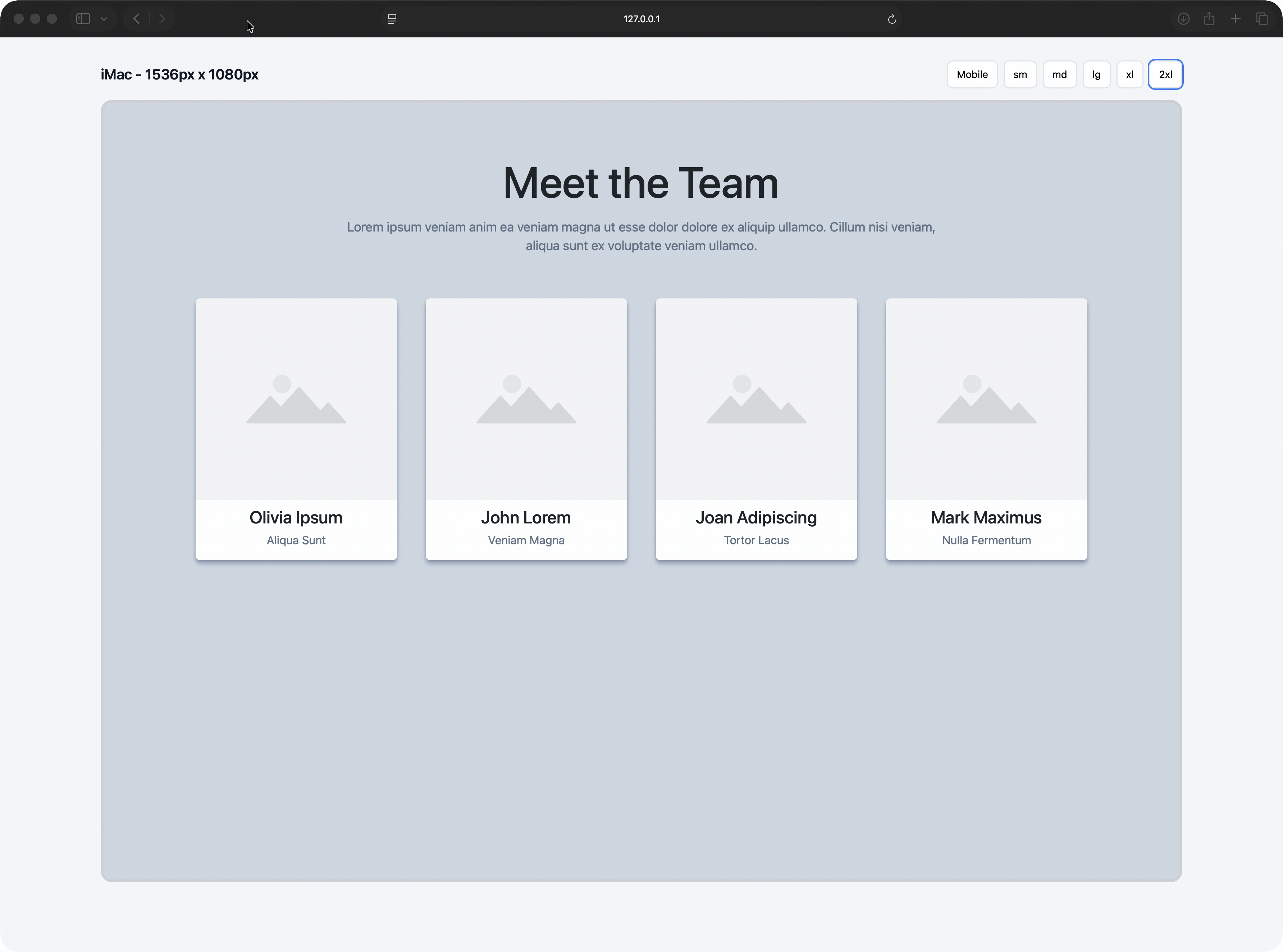
Any how, with a hard coded “Mobile size” here’s a demo of what I have been working on.
Note you will only see device buttons relevant to the screen size you view the demo on, eg if you view on an iPad you won’t see the laptop and desktop buttons. You can test that feature by resizing teh browser window.
Even though I was explicitly told Alpine.js is included only if at least one Realmac component exists in the page, I battered my head for way to long before realising why my component didn’t work if alone.
In your screenshot: That’s not actually the mobile breakpoint you’re editing — it’s the width of the underlying .container class, which we use in the Container component.
I don’t think this is a bug. As above, the mobile breakpoint isn’t editable by the user.
The true “mobile” breakpoint in Tailwind isn’t a fixed value; it simply refers to any styles that are not prefixed by a device size (which essentially pushes you to embrace a mobile first approach).
Those base styles apply by default, and are only overridden once you specify a device-prefixed class such as sm:, md:, or lg:.
If you want a dedicated mobile preview, I’d recommend hard-coding a device width specifically for mobile. Maybe 320px would work, since it’s half the default sm breakpoint. If you want to keep things dynamic, you could calculate it as half of whatever sm is set to.
Funnily enough, I’ve already built a very similar component to this. We’ll be using it internally to provide live previews in some upcoming projects.
Here’s a couple of screenshots of my “iFrame Preview” component.
In Elements you can drop in any content and that will be used as the iFrame’s source.
Does yours work with content that uses Apline or an external js file?
I started doing mine the way you have with a drop zone for the frames content, but ran into difficulties getting all the required js and alpine into the frame for components that have dependancies or there own js files. So mine now uses another page from the same site at the content.
and if injecting the JS doesn’t work, I’d probably solve it by just added a link control to the iFrame Preview component, so you could link to any page as the iframe source.
Yes thats what I ended up doing, as couldn’t solve the js issues. So I just link to another page (in the site, so no cross domain issues).
I might have another shot at the better method of using a drop zone for the frames content. Only plan I can think of is clone the entire document as the source for the frame , then hide everything in the Dom that wasn’t in the drop zone. Tricky though.
Also intrigued how you’r toggling dark light mode, with Elements Tailwind build type of “media”.
I’m grabbing all the CSS files on the page and injecting those in to the iFrame. If you’re doing some custom CSS inline on the page, then that’s not going to come over in my component (likely we could make that work though).
As for the javascript, I think you should be able to grab all the script tags on the original page and inject those in to the iFrame. In my head (hah!) it should “just work”
Yeah, but with Elements current Tailwind build, The live Dark / Light mode toggle you’re showing must surely be a concept at the moment right?
Without manually overriding every css rule for everything in the frame this isn’t possible until Elements builds Tailwind 3 in class mode or moves to Tailwind 4?


