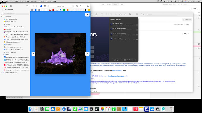
ive used squash to make all my images the same size and dpi etc and they all show ok in the gallery but is there a way to make them bigger…in my published site as I drag the screen in they get a little bigger then gradually smaller again but I would like em a little bigger to start with n the widest page…I can make em smaller but never bigger
TIA
The Gallery ensures that images are displayed as large as possible while maintaining their original aspect ratio and adapting to the viewport size - so that no part of the image is cropped.
It also adds a small amount of padding around the images to make sure they don’t overlap with the navigation or close buttons.
So your images are being shown at the largest size possible within those three constraints. Hope that helps! ![]()
thanks but yes and no…the images get bigger as I drag the side of the browser in and as I get to the smaller size the buttons DO overlap the image.as seen here,
I guess its a browser thing but maybe the spacing on the widest breakpoint is to much?
gallery changes as I change screen size
so does mine but look at the images…starts of at a size gets bigger then smaller . and at the widest break point even on your video try and make em slightly bigger…you cant I have 3 copies of the same image all different sizes but all appear as 1 size in the browser..
same for me
so why cant the bigger size be the default…thats what id prefer
In the last screenshot the image can’t get any bigger due to it needing to maintain the original image aspect ratio whilst also adapting to the viewport size.
not sure, Elements only works upto 2xl I believe?, cant define bigger screen sizes, you can in Tailwind, I am probably wrong here, perhaps image is set for max 2xl, or you may be talking about something else, then I have no idea
2xl: 1536px
I have actually just checked the code again, and I think I can improve on one thing that could keep the image at a larger size.
I won’t go in to code details, as I’m not sure it’s relevant for this thread, but I’ll see if we can get an update in to the next beta that should at least improve the sizing at certain screen sizes ![]()
not trying to define bigger screen…just needs less spacing round the gallery items I think. doesnt even need scroll arrows on a mobile as most people scroll with their fingers.
cheers ben for even looking at it.
Just a quick update: this one has been fixed and will be included in an upcoming beta ![]()
brilliant
thanks


