Hi, I am working on this page.
I am trying to make @media CSS rule for the page, put I can’t get it working. I have, as you might see int the shot screen, tried to add some normal CSS - and it is not recognizing this either.
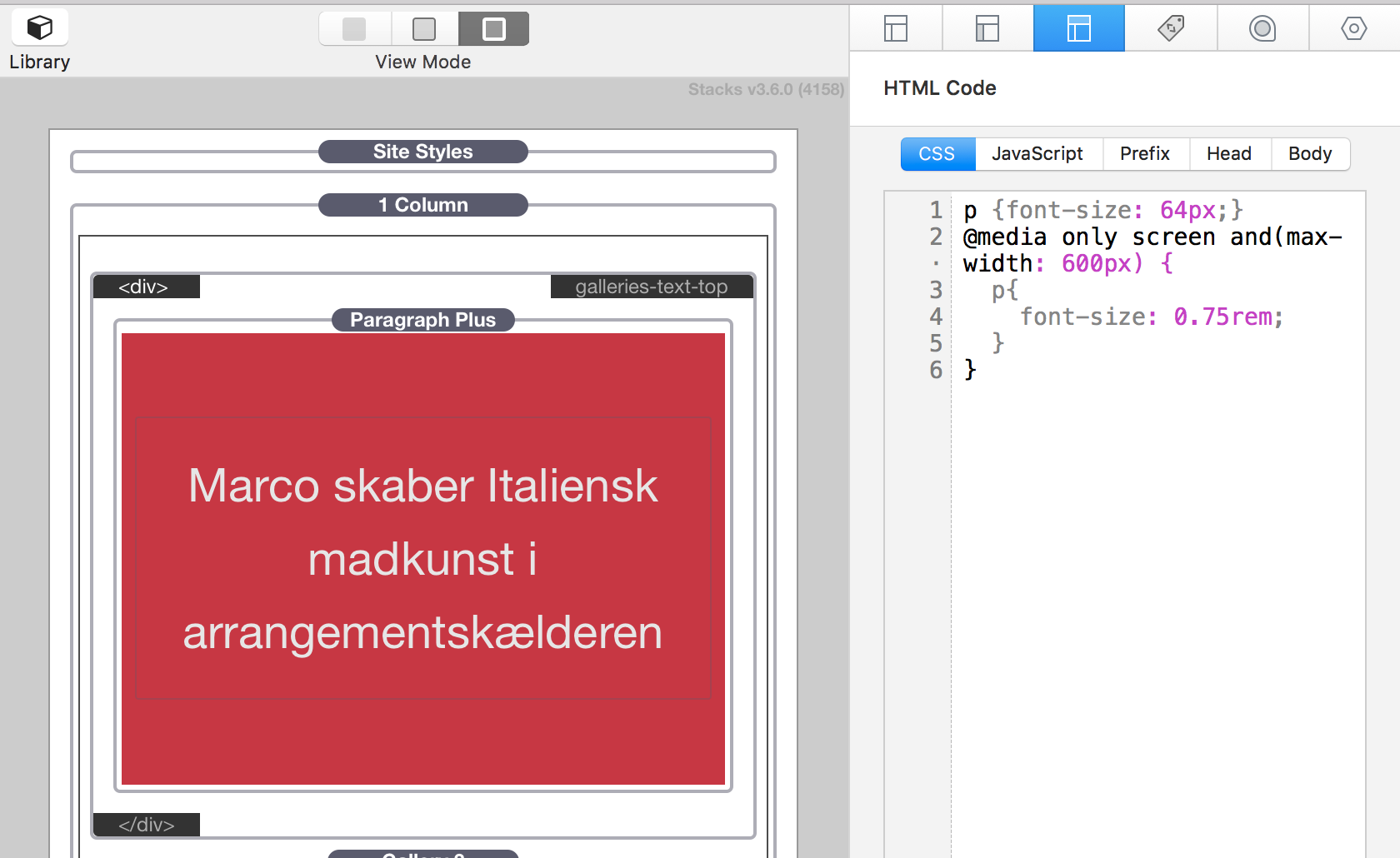
Slight adjustment needed to your breakpoint rules and you will need to use !important declarations to override the CSS your theme / stacks are already applying to HTML <p> tags via ID selectors:
/* On wider screens */
p {
     font-size: 64px !important;
}

/* On narrower screens less-than 600px */
@media screen and (max-width: 600px) {
    p {
        font-size: 0.75rem !important;
    }
}