Unfortunately, the image element doesn’t support hover. I imagine a face with closed eyes, and when hovered, the eyes are open. Would that be possible?
Or can it, and I just haven’t found it?
Unfortunately, the image element doesn’t support hover. I imagine a face with closed eyes, and when hovered, the eyes are open. Would that be possible?
Or can it, and I just haven’t found it?
Yes please.
Instead of using the image component, use a container. There you can set an image as background and change it on hover.
Here it is @Ulrich …
elementsapp://downloadDocument/k7Mnnp2Z7Si5
Should look like this one
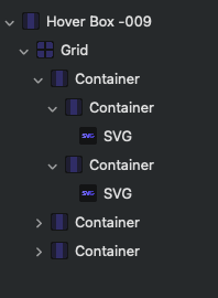
I did it somehow as @pumpkin said I put SVGs in 2 different container.
You can replace the SVG with Image or as @pumpkin said you also can use the background of the Container.
An important setting is in the Container with the SVGs (the underlying one with the second “red” background. Look at the “layout” settings. The Position is set to “Absolute”. With this setting the one Container is exactly over the other.
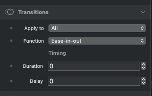
Another setting is the transition effect set to Duration 0. It now switches immediately from the one SVG to the other
That’s a great idea to make it about size. Thanks for that. I’ll try it out.
If you need something simpler, you could also do this with a Container or a Button…
@dan can you explain how to do this? I would like to have one image show on the page and then another overlay that image with a different image when I rollover. It looks similar to what you have demonstrated, just not quite sure how to do it! Thanks
Yes, I’d do this with a Button Component, here’s how to set it up:
Great , more stuff like this … @dan
@dan I’d like to see something like this, but instead of switching from one image to another, it switches from an image to some content in a container, like a header, text, and button. I have a way to do this, but it is done by sliding the content in from out of view. I’d prefer to do it by changing the opacity.
@dan - thanks for taking the time to explain this. This looks really simple to implement (once you know how!) and is just what I need. Thanks!
Thanx great idea - will use this a lot…
I think I know what you’re after, and it’s easy to build with a couple of the built in components, here’s a video showing how I’d build something like this 
Here the project from the video, for those that want to have a play with this stuff
@ben That was very handy, thanks for doing that. I’ll play with it some more.
I wanted to do something that did more of a 3D flip, so I wrote one with the help of our friendly bot. It works reasonably well, but we discovered that several Tailwind classes did not appear to be available to make this more Tailwind-like. This meant that the styling was being handled in more older CSS style. It works, but could be more polished. I’m in the process of trying to turn this into a custom component.
Could something like this be done without writing a custom component? See below.

I ended up going down the custom component approach for something like this but with more of a 3D flip. I think it works well, but it is in need of more properties to make it complete.
Here is what it looks like on a live site.

That really does look awesome, nice work 
Very cool  good job!!!