Is there a stack for images that automatically resizes images so they’re at a consistent size throughout the site?
I’ve not had to change the images in the image stacks that I have used. The images have sized to the screen they are using automatically. However one image for a 27" Mac screen is big (bytes size) in comparison to one that would be better for a mobile screen so your mobile device ends up loading the larger image and resizing.
There is an stack that can load different size images into the website and only call the correct sized one depending on the device in use (mobile, tablet or desktop). Unfortunately I can’t remember its name.
Photobulk will bulk resize, but I just tend to use Mac Preview and resize images using that. I then put them through an image optimiser app you reduce the file size further.
I think you’re referring to Srcerer - https://shakingthehabitual.com/stacks/srcerer/
Hi @zamboknee,
Please take a look at Image Fit Stack.
You can set images of different sizes to display with the exactly the same dimensions, plus many other features, including shadows, borders, transformations, animation etc.
Cheers,
Ricardo
Be careful there. Looking at the Image Fit Stack, it’s only resizing the image on the page, not resizing the image itself. The example surfing.jpg says it’s resizing to 200x200 but if you look at the source file it’s actually 1080 x 720 so not quite what you want if you want to resize the image in the project file.
To clarify, I’m looking for a stack that, no matter what size the picture is, when dropped in there it will change the size to a preset width and height.
Preferably, to line up with the Youtube embeds I have.
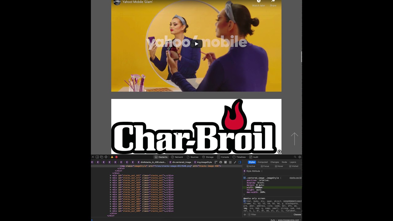
If you go to my sight and scroll down to the first few videos I have (moosevoice.com) you’ll see that the pic of the brand/logos are a little all over the place and not aligning with the player below them.
Yes, I could make sure the pics are all at, let’s say, 1200x800 but I was hoping to make things a little easier on me.
@zamboknee You want a preset height and width: but that won’t work well on all browsers (think phone, tablet, computer).
Making all your images 1200x800 (or whatever is best to go with the YouTubes) is simple enough. Not sure why this is a hard option. There are a lot of apps out there for resizing images before you bring into RW: and that’s really the best way to go. PhotoBulk at the App store is really good, but there are other options also.
Try putting this bit of css in the page inspector css panel and see if that does the trick.
It should make all those logo images stretch to full the container. Give it a try and see what happens.
.centered_image .imageStyle {
position: relative;
display: block;
margin: 0 auto;
width: 2500px;
height: auto;
max-width: 100%;
}
Wow, you’ve got a lot in the css panel there! OK, all I can say it works when you edit the width in the browser developer panel as per my screenshot.
css does obviously ‘cascade’ so maybe there is another width setting that’s overriding it.
Image Fit does not advertise that will actually change the sizes of your image. It but will display them in the exact size that you want in your page without touching the original. Therefore with one set of images, you can create thumbnails, and you can display them in their original size where needed, in a lightbox for example.
If you want to have your images resized before bringing them into your project, then I agree with @Mathew, Photobulk is the way to go.
Cheers,
Ricardo
Hi Andi,
From this clarification, it sounds like Image Fit will do what you’re looking for.
Please let me know if you have any questions.
Cheers,
Ricardo
Did Photobulk. Things seem fine but one image I changed to 988 (width) is still showing as being VERY much larger than that setting.
I know this doesn’t help right-now, but I wanted to give a heads-up and let people know that Squash 3 will be available soon — This new version handles batch resizing (and so much more).
We’ll be looking for beta testers shortly. Ping me a message if you’re interested (this is open to everyone here).
Not sure I understand where it is “showing”. The screenshot above shows the image(what gets loaded) as being 988px wide.
If the display area on the page is larger than the images the image might be stretched to fit the space.
Might be easier to check with a URL instead of the screenshot.
This topic was automatically closed 30 days after the last reply. New replies are no longer allowed.


