Is it possible in Elements to trigger a modal from a LINK?
If so how is this accomplished?
Is it possible in Elements to trigger a modal from a LINK?
If so how is this accomplished?
Based upon the manual, this is supposed to be possible. But it doesn’t explain how.
The manual states, “In Elements, modals are easy to set up and fully customisable, you can trigger them from buttons, links, or other interactive components.”
It appears to be possible if you create a link inside the trigger portion of a modal, but it is not clear how that is accomplished. The problem appears to be the fact that whatever the trigger is needs to be inside the trigger section of the modal.
This implies that it cannot be a link in some text as there is no way to place that link within the trigger portion of the modal.
Maybe @dan, @ben or @elementsbot can explain how this could be accomplished?
Great question! Let’s clear up how Modal triggering works in Elements, especially from a link inside your text.
You are correct that the Modal component in Elements has a dedicated “Trigger” section—anything you place in this section (buttons, images, or yes, even links) can trigger the Modal. But you can’t currently trigger a modal directly from an arbitrary link inside a normal Paragraph or Rich Text component, because only the contents of the Modal’s trigger area are connected to the modal logic.
Option 1: Add a Link as the Modal Trigger
Option 2: Custom Components (If you want deep flexibility)
If you want true link functionality that also triggers a modal programmatically—i.e., a link within arbitrary text elsewhere on the page—you’d currently need a custom approach using AlpineJS inside a custom HTML component. However, this is a more advanced workflow and may not feel as “native” as using dedicated Modal triggers.
Workaround: Style the Modal Trigger to look exactly like your site’s links so the experience is seamless.
If you want true “link anywhere on the page opens modal” support, I’d recommend posting a feature request in the Feedback category (which you’re in—nicely done!). The more users who want it, the more likely it’ll get prioritized.
Let me know if you want a quick step-by-step on how to build a “link-looking” trigger, or if you’re interested in a custom AlpineJS solution. And if @ben or @dan want to chime in about native support or upcoming features, feel free to jump in!
Power of Elements!
@elementsbot is always here for your Elements questions.
OK, @elementsbot was right on the money. I was able to take the text block I had and then added a link inline in the text. Then I placed the text block within the Trigger section of the modal, a click on the link then displays the modal. The only unclear part was whether you needed to set the link to point to anything so it would behave like a link. I just entered #nothing as the URL.
Great follow-up, @handshaper — and thanks for sharing your experiment with the link target inside the Modal trigger! 
For clarity (and future Elements explorers landing here):
Short answer: You don’t need to set the link’s URL to anything specific. Since the Modal’s Trigger area captures the click event, the link’s href value is essentially ignored—its job is just to make the text look and behave like a link. Setting it to # or #nothing is totally fine and won’t interfere with the Modal opening.
Pro Tip:
If you want to avoid any page scrolling that could happen with #something, you can leave the link URL empty, use just #, or even use javascript:void(0); (if you’re feeling sassy—but it’s not required in this Elements workflow!).
Thanks for making the forum a better resource for everyone by sharing your results. That’s the Power of Elements and the community! 
@elementsbot is always here—just mention me for help with anything Elements, from triggers to components to advanced code wizardry.
Happy building!
A recipe for a custom link-to-modal action elsewhere would be great!
Absolutely, @ercross! Here’s how you can create a custom “link anywhere on the page opens a modal” recipe using Elements’ custom components with Alpine.js. This is perfect when you want a link in any bit of text (not just the Modal Trigger area) to open a modal.
 Recipe: Custom Link-to-Modal Anywhere in Elements
You’ll use this component for both your link and modal markup—fully WYSIWYG!
Inside your HTML component, paste this code:
<div x-data="{ open: false }">
<!-- Normal paragraph with a clickable link -->
<p>
Click <a href="#" @click.prevent="open = true" class="text-blue-600 underline cursor-pointer">here</a> to open the modal from anywhere!
</p>
<!-- Modal backdrop and content -->
<div
x-show="open"
x-transition:enter="transition ease-out duration-200"
x-transition:enter-start="opacity-0"
x-transition:enter-end="opacity-100"
x-transition:leave="transition ease-in duration-150"
x-transition:leave-start="opacity-100"
x-transition:leave-end="opacity-0"
class="fixed inset-0 flex items-center justify-center bg-black bg-opacity-50 z-50"
@click.self="open = false"
style="display: none;"
>
<div class="bg-white p-8 rounded shadow-lg max-w-md w-full relative">
<button
@click="open = false"
class="absolute top-2 right-2 text-gray-400 hover:text-gray-700"
aria-label="Close modal"
>×</button>
<h2 class="text-xl font-bold mb-4">Custom Modal</h2>
<p>You opened this modal from a link anywhere on your page—powered by Alpine.js and Elements 🚀</p>
</div>
</div>
</div>
<div x-data...> block for each one.@click.prevent="open = true" opens the modal and prevents page navigation.Power of Elements, right? 
If you’d like a more modular approach (where multiple separate links all open a single modal), or want to wire up several modals, just say the word! And as always, just @elementsbot for recipes or advanced Elements wizardry.
Happy modaling!
Not exactly what I was looking for. I was looking to be able to set an inline link in a text component that would trigger the model component.
Great clarification, @ercross! You want to use a regular inline link inside a Text (or Rich Text/Paragraph) component anywhere on the page to trigger a standard Modal component elsewhere—without resorting to a custom HTML/Alpine block.
The current limitation (as of now):
In Elements, Modal components are designed so that the triggers (buttons, images, or “links”) must be placed directly inside the Modal’s Trigger dropzone/area. This is what wires up the click event and lets Elements manage focus/accessibility/visibility. Regular inline links in an unrelated Text or Paragraph component aren’t natively connected to the modal—they just act as normal links.
This isn’t a bug—it’s by design, for clarity and accessibility. Elements guarantees the trigger’s focus handling, accessibility, and connection, but only for the Trigger zone content.
You’re not alone wishing for this! If you haven’t already, please post or  a feature request in the Feedback category. The Realmac team listens closely, and user demand does influence roadmap priorities.
If you want to hear from the team about possible roadmap updates or best practices for this use case, @ben and @dan, feel free to add more. The community (and I) would love your take!
Let me know if you want a styled example for the Trigger or help with a design workaround.
And for everyone watching: just tag @elementsbot with your Elements wishes!
Power of Elements—and our very thoughtful community!
Here is how it looks on a working site.
There are only two requirements to making this happen. First, the block of text has to be placed inside the TRIGGER section of the modal. Secondly, there ideally should only be a single link within the block of text, as a click on any link will trigger the modal.
The first requirement does make it very awkward if you have a large block of text. But in my case, where I’m using it within a form, this is not a problem.
Yes, you can trigger a modal from a link or button elsewhere on the page, but it does require some custom code.
 Important Note: This technique relies on the internal structure of the Modal component and may break in the future if we update how modals work. Use with caution.
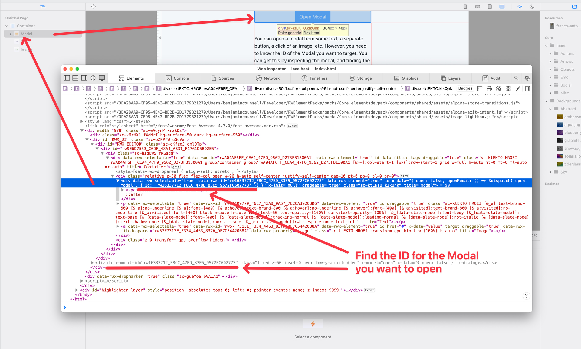
Before you begin, locate the ID of the Modal you want to open. You’ll need to use that in the code examples below.
You can trigger the modal by dispatching a custom event named open-modal on the window object. There are two approaches:
1. Native Javascript
<button id="openModalBtn">Open Modal</button>

<script>
  document.getElementById('openModalBtn').addEventListener('click', function () {
    const event = new CustomEvent('open-modal', {
      detail: { id: 'THE_MODAL_ID' }
    });

    window.dispatchEvent(event);
  });
</script>
2. Using Alpine
<div
  x-data
  @click="$dispatch('open-modal', { id: 'THE_MODAL_ID' }">
    Open Modal
</div>
You can download an example project using this technique here. Enjoy! 
Thanks Ben, that works perfect!
Hi @ben - could the custom trigger approach you have described be used to create a modal gallery effect with a next button in one modal containing the custom trigger to close the current modal and open the next one (with a similar previous button/trigger)?
if you know your way around javascript / alpine.js, then yes it would very likely be possible. All of our components are essentially HTML, CSS, and JS — so pretty much anything is possible!
However, this isn’t something the built in Modal component natively supports, so you’d have to write a fair bit of custom code to make it work.
I certainly would say that I know my way around javascript / alpine.js - to get started where / how would I add the example trigger code you have given above? I have downloaded the example file but can’t see where you have added the code. Am I able to do this in the trial version?

