The only thing missing from making a truly functional button is to have HOVER support for text so that you can change the text color on hover. Never understood why this is not supported in Elements. There are so many cases that can be made for being able to set hover colors for simple text.
@ben yes, I know I can change the button text, but that is not what I was referring too, I want a hover color for a text component. That is what is being used in this button. There are many other uses for text with a hover color.
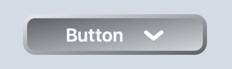
Ohhh I see, I thought the screenshot was showing a Button component
Out of curiosity, what made you not be able to use the Button component in this case? Wondering if it’s actually something missing on the Button component
@ben There was no way to do this with a button component as to achieve this the button needed to be constructed from multiple layers. In this case, there are three flex components. The outer is rendering the border gradient, the inner is rendering the surface gradient, and the final one is managing the text and icon. The gradients then adjust as you roll over the button to create an effect of the button being depressed.
I don’t think the button component could handle this style of rendering, other than it could do the surface gradient. I suppose now that I think of it I could have nested a button component within the outer flex to achieve the same effect, which would then have allowed me to handle the text using the button’s properties. I’ll give that a try as a way to get the text color changes.
As I had mentioned I have found numerous other cases where it would have been nice to have the ability to set a hover color on the text component, e.g., a title on an accordion. I like to experiment with building up more complex components out of the core ones, but have always found that when it came to text in these components I was limited by the inability to set a hover color.
After thinking about this more I realized I might be able to build out the same style button using the button component and a flex. So I changed what I had and now have a button that can change the color of the text. There is a flex with a button nested inside it, took a little massaging of the button to make it look right.
More experimenting with the gradients needed to get the lighting correct.
This solved the need for a hover color on the text, but I still believe there is a valid case to be made for supporting a hover color on a text component. If needed I can provide many more examples of why I think it is valid.

