If I add the following custom css to the page (same as transform-gpu) the shadow renders properly, suggesting that the transform-gpu should actually me applied to the image it’s self and not the wrapper div to function correctly.
Thanks Steve, yes for specific images box-shadow can be a workaround. But it’s really more about fixing the bug in filter, so it works across the board.
I think I highlighted another bug in the Image component in my video unwittingly.
Image component > Advanced > classes & ID, should also be added to the image tag where you’d expect them to be added, and not on the outer parent div as they currently are.
Further testing (I can’t put stuff like this down ) tells me this is a race condition.
It explains why it works inside of the elements UI, and fails in the browser. Inside Elements, the image is on hand. In the browser it takes time to load, and until it has, well the browser does not know where to render the shadow,
transform-gpu simply gives the image a chance to load while it’s doing its thing that takes the browser an arbitrary time to promote the image to the GPU. Confirmed by using.a large uncompressed image that takes a while to load, even adding my workaround does not work.
transform-gpu, will-change-contents, and image priority high, all help, but non are failsafe. If the image loads slow it fails and clips the shadow. The browser seems to simply give up after a finite time trying.
So this does seem to be on the face of it a browser bug (webKit) else drop-shadow CSS was never designed for transparent images.
Yeah, giving up now. There’s something wrong I’m just not seeing with the way the filters are being applied. It’s the same deal for “Blur”.
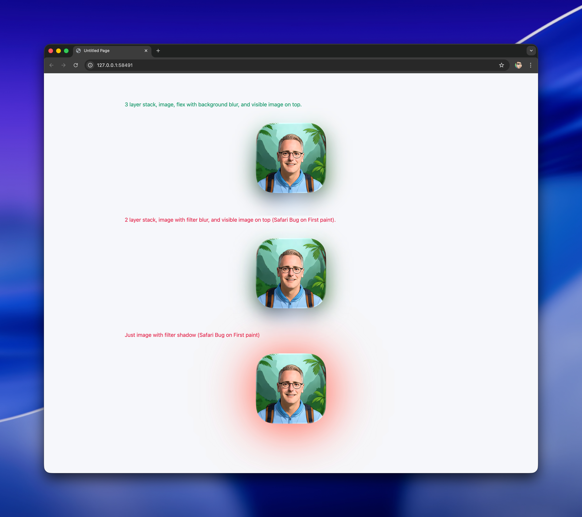
So I thought ok, I’ll use a copy of the image (blurred) behind the visible image to make the shadow. It is actually even nicer as you get the colours from the image its self.
But no it’s the same deal. Absolutely position a duplicate image under visible image and apply filter blur, works inside elements UI but again gets clipped in the browser.
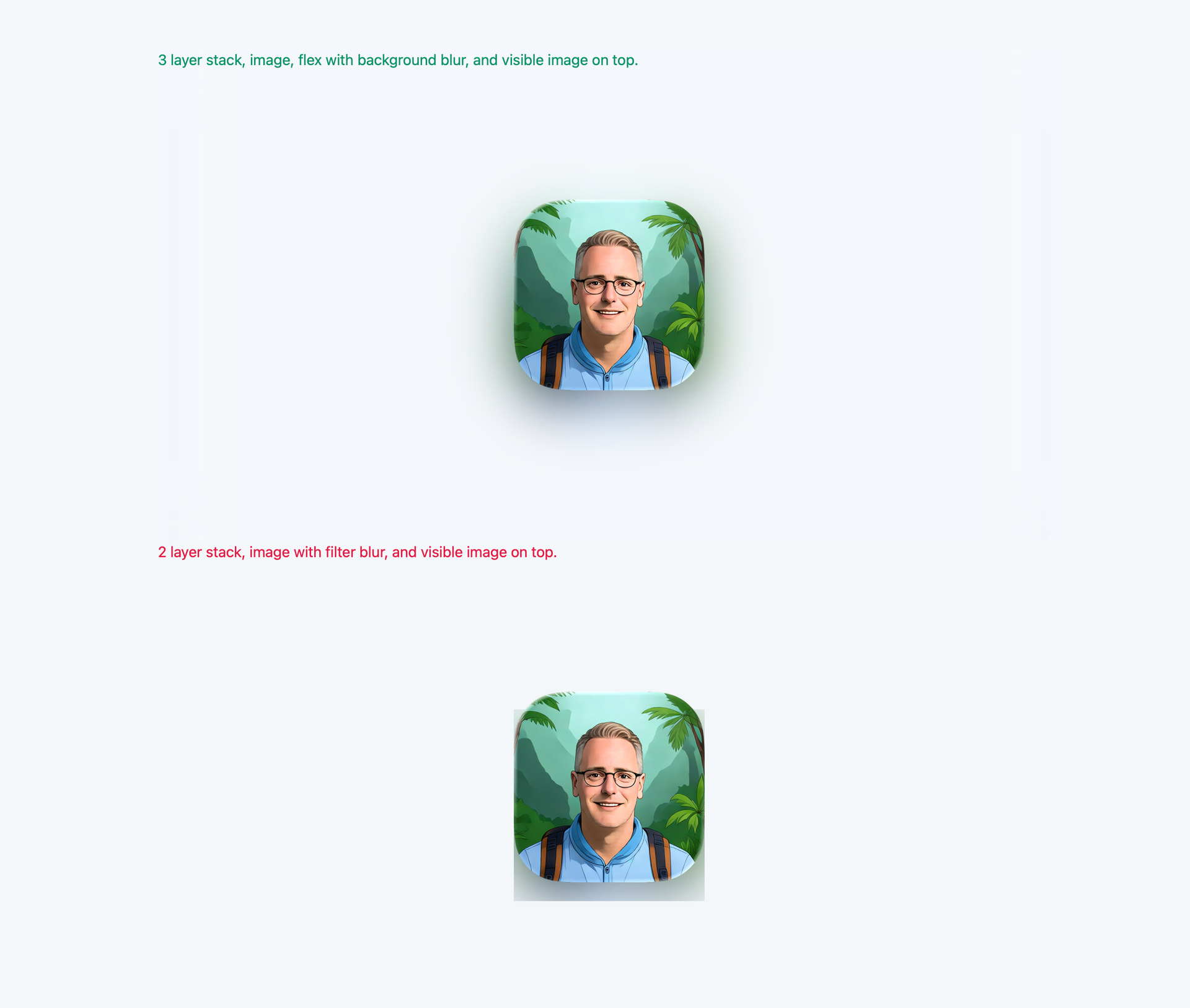
The only thing that actually works is a three layer setup.
The duplicate image absolutely positioned, then a fleck box absolutely positioned over it with background blur, then the visible image stacked on top. Works a treat. but oh my, thats some workaround.
So I went ahead and made a little utility app to convert bitmap images to SVG’s to save opening and re-exporting from a fully fledged image editor. It’s free, but does require macOS Tahoe for simplicity (my side).
New Download: 1.0.1
Added Sparkle updater for future updates and couple of fixes. Download Vexel App


 ) tells me this is a race condition.


