It definitely can be done. I’m pretty busy over the next few of weeks and won’t be near a Mac much.
From a coding standpoint, the solution is really quite simple, it called CSS Flexbox. It’s nothing new (2009 even IE11 supports it), and I could give you native CSS and Html to do the columns and the “stretching” the column content pretty effortlessly.
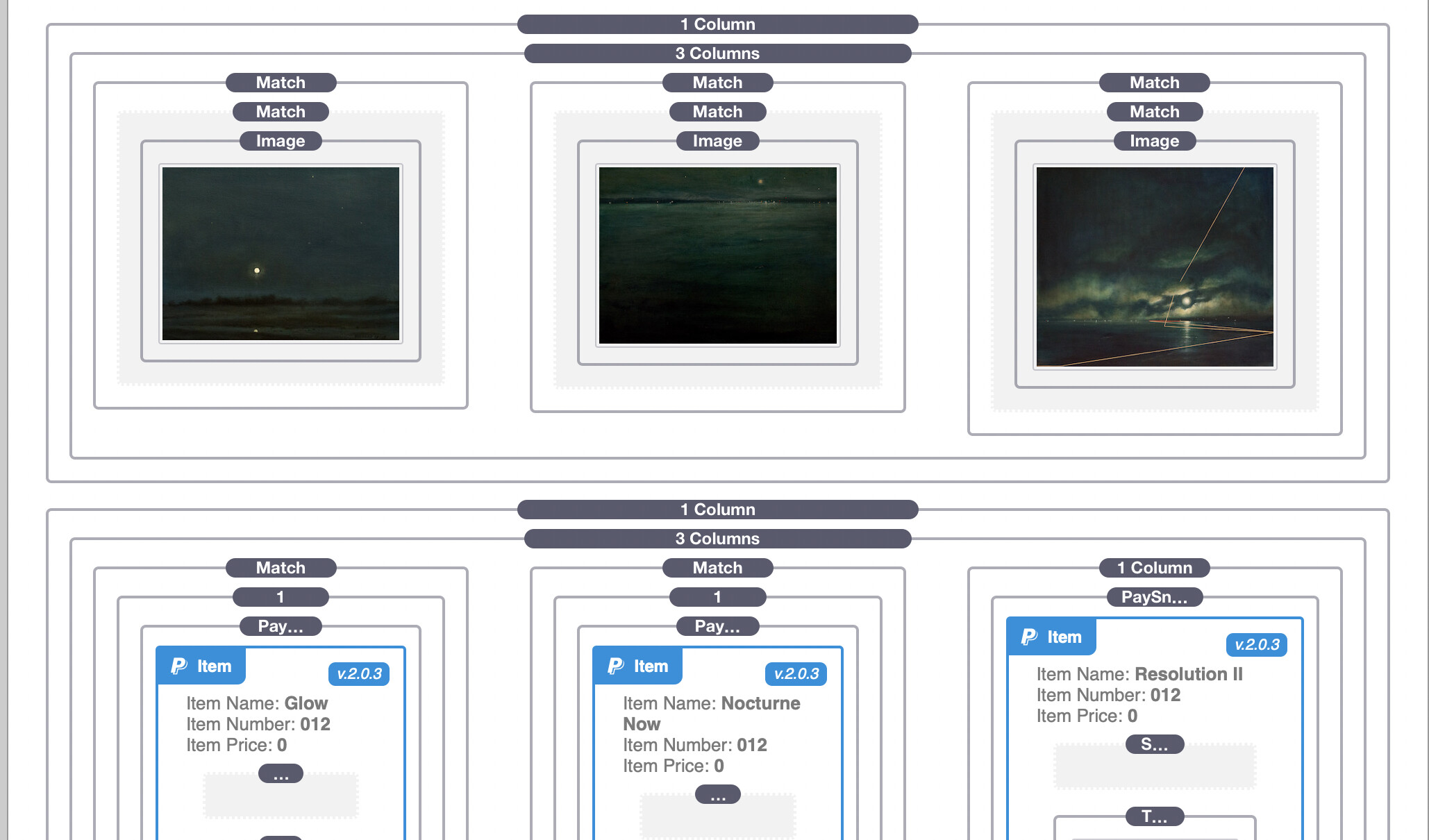
The problem comes in trying to use most of the column stacks available. Most of the stacks to make columns or sometimes called grids use an old technique (called float and clearfix), that fakes even ancient browsers into allowing responsive page layout.
I can’t tell you what stacks use what technique, without manually checking everyone out there, and I don’t know what stacks you have. Now I know for instance Foundation 6 uses Flexbox for responsive layout, Foundry like the column stacks that come with stacks still uses the former Float and Clearfix.
Now, normally I could simply give you some simple code (~10 lines) to add to any column that could easily create a column body that would separate the image evenly from the text. Kind of a header, body, and footer. The problem, flex ox to work relies on a direct Parent siblings relationship. Normal stacks put all these stacks-out, stacks-in divisions in place that break that direct relationship that Flexbox (and CSS grid) rely on.
I know this sounds very technical, but it’s a limitation of most stacks (Foundation 6 is one exception).
Now I could give some code that would work if you could tell me the fixed height of the tallest column you are using.
Others out there might know of a solution, there are tons of stacks that I don’t use or even know about.
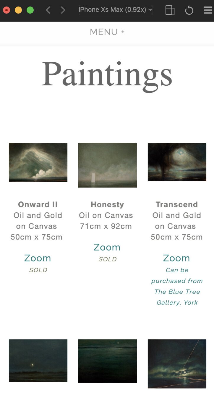
I think the more important thing is that you stop using non-responsive columns. Usability always should be more important that styling. Right now your site with 3 column wide layout on small screens (about half of the users are on mobile) is almost unusable. I can’t tell one image from the next on my iPhone 7.


 .
.