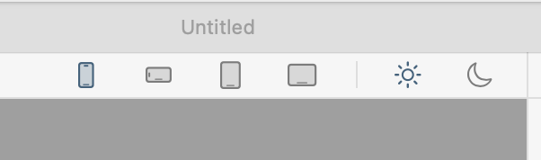
I think there’ maybe a slight difference in the icon color to indicate which screen size is selected? If so, that needs to be made more obvious. I suggest you folks find a color blind person to explain what they can and cannot see in the UI.
He he. I am quite badly colour blind. On my screen I can see which screen size is chosen, it is not obvious but I can just see it.
On your screenshot I cannot see any selection at all, must be due to the background colour. make the selected logo bold I say, or with a border.
At least the screen icons are solid icons. The icons at the top of the navigation bar are not solid and therefore the colour change is almost impossible to see.
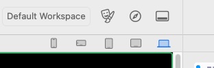
But it is also going to somewhat depend on what highlight color you have selected on your Mac. Mine is ORANGE hence the orange highlighting. Blue is the default but I always find it hard to spot so I always switch it.