I’ve have a select control (id is myid) and selected desktop & enabled the little dot to set value for that device, then selected sm & enabled the little dot & selected another value. And then of course I put {{myid}} in the class which exports this code: sm:top-0 left-0 lg:bottom-0 left-0
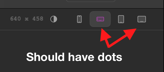
When I click the device icons in the upper panel, the values change in the side control but the div it’s being applied to don’t move AND the dots under the icons are not staying either.
Is the solution to put square brackets around the values and not a device name, or is there another bug here?
Just wanted to jump in here and say that you can’t set two classes in a control value as you are doing and expect Elements to make them both responsive.
Elements will make the control value responsive by prefixing it with responsive modifiers.
So your exported value (sm:top-0 left-0 lg:bottom-0 left-0) is working “as expected”, but likely not working as you expected - note that left-0 is not prefixed with any responsive modifiers.
The simplest solution to this is to separate out each value in to its own control as this will allow Elements to correctly add responsive modifiers to the individual values.
Just wanted to give an update here and say that you can now have multiple tailwind classes in s value and Elements will magically make all tailwind classes in the string value responsive.
This means that the above statement is now incorrect. You can have the following control and Elements will make all classes responsive:
As a simple demo, try setting base to top left, md to top center and lg to top right. Because of various settings in a smaller breakpoint the larger breakpoints will be broken. There are other combinations that break as well, but I think this introduces the problem with classes carrying forward to larger breakpoints and causing problems.
What you’re describing is a fundamental aspect of CSS cascading. If you set a property in a CSS class outside a media query, it applies universally until another class or media query overrides it.
This behavior applies to Tailwind as well. In this case, you’re assigning various classes to control values, which means you’ll need to define or reset CSS properties for each control state individually.
For example, if a user selects Bottom Left positioning on mobile and Bottom Right on desktop, you need to ensure that switching to Bottom Right on desktop removes or adjusts the previous left positioning - and vice versa.
This isn’t unique to Tailwind, control values, or Elements—it’s simply how CSS cascading and specificity work.