Is there aa way of stopping the SPLIT theme from being responsive to different browser widths? I just want it to be set to full view - rather than shrinking and changing the nav bar and general format as it looks poor.
Any ideas on how I would code this in? @Oscar@yuzool - feel like this is one for you guys!!
Beyond my area of expertise, but simply changing the body tag to be a fixed width won’t do it. There is a lot of CSS in the Theme to make it responsive and do it’s magic. The Theme would require extensive reworking to make it fixed width only.
I’m sure that @yuzool would gladly do it should you file a request through the support system, but that would fall under custom work and be billable.
Just Read @zeebe’s response (thanks Robert). I would have to concur unless @oscar has some severe magic up his sleeve
I also asked me/you.
Choose another theme (for example HV Foton) or a not responsive theme.
The full view of what, of the header or the content?
With Split you have always the full view (of the header, but not of the content, that’s right) and on small screens it does not make sense to have a not responsive nav bar.
I think you are right @Oscar… I have had a change of heart!
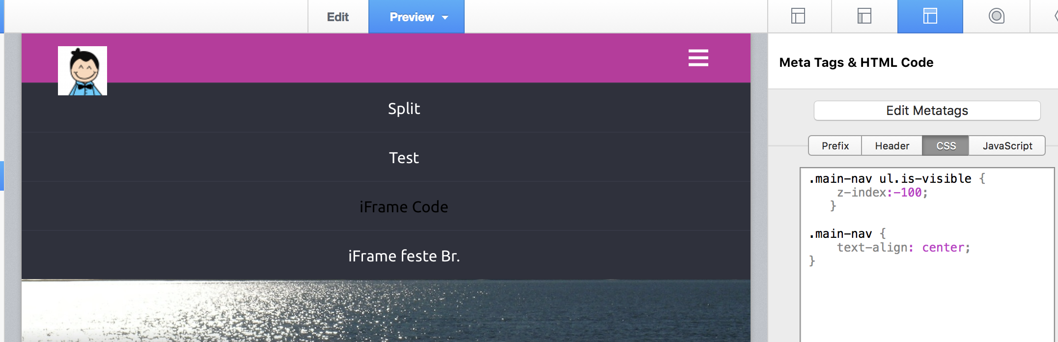
I think I just need to make the site work for both mobile and pc viewing. This is where I may need your help, I am trying to figure out how to get the responsive mobile nav bar to align text to the right, so that the Logo is visable? And then have the logo ‘on top’ of all the other layers so that it can be seen.
Any Ideas on how I format the mobile/responsive nav bar?? I have attached some images to help
Should do it for both ‘right’ and ‘center’. Center looks best though, in my view. OP wanted this so that the logo is visible, I think? Would need to see an example (not a screen capture, a URL) of the logo not being visible in responsive menu to say anything about that.
With this code, your smartphone menu is with opacity.
You can change the values. Attention, the menu text has the same opacity … and now, you can see title and slogan!
