NEW Blog Template: Maximilian for Elements

Dear Elements Weavers,

I just released another template. It is called Maximilian and it is redone with Elements from the original design I made 3 years ago in Rapidweaver Classic, Stacks, Foundry and Alloy. It is pure Elements using the integrated CMS. Three years ago I needed four Apps/Plugins to create it and today „only“ Elements.

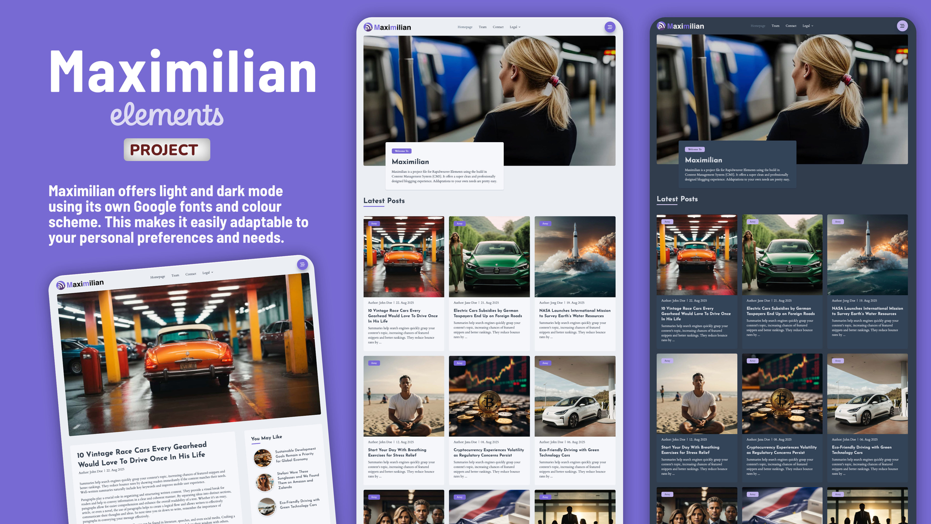
What is Maximilian? Maximilian provides a sleek, minimalist and professionally designed blogging experience with a hint of technical flair. If you’re looking for a cool blog, Maximilian is the perfect solution. A fantastic, easy to handle blog template. Fully based on the Elements CMS.

Maximilian delivers everything you’d expect from a modern Elements template, including light and dark mode using its own Google fonts and colour scheme. This allows for easy customisation to suit your personal preferences and needs.

Beyond the blog pages, you’ll find a range of other useful design templates for team pages, contact pages and legal documents.

Maximilian: The Blogging Solution using Elements CMS

Maximilian is completely developed with the fleXon design library. The coming version 1.6 of fleXon will include the complete set of sections.

Please note: Maximilian is built on Elements CMS, which is currently in early beta. This means compatibility issues may arise with future updates. I’m committed to maintaining and improving the template as new features are released. However, if you prefer a fully stable product, I recommend waiting until Elements CMS and Maximilian reaches a more mature stage before purchasing.

You can find more details at the old Elements Marketplace or at the WeaverPixel Homepage

You can directly preview a sample page here

Hope you like what I have created.

2 Likes

Hi,
Check the footer links color in dark mode.

great job Markus! nice template

Hi @annebourdon
That is one of the old bugs in Elements. I reported it here back in January. Will be solved with the Tailwind 4 implementation I understood.

https://forums.realmacsoftware.com/t/bug-in-the-text-component/45936

And unfortunatelly it still exists. Maybe as the Marketplace now is online there will be priorities for the Tailwind 4 implementation.

2 Likes

Thanks @MultiThemes Michelangelo. Means a lot to me when a great designer like you is saying that :blush:

1 Like

Yes - positive praise - very good job :clap:

Thanks Mike @MichaelDroste :+1:

1 Like

You are correct that there’s an issue with dark-mode link colours when setting a link inside Text components. You can work around this by assigning a custom class directly on the linked text, for example dark:text-brand-50, like so:

After looking through your project, there are a couple of structural choices that could be improved to avoid this dark-mode problem and make the layout more user-friendly overall.

First, the “Our Pages” column could have used the Top Pages component instead of manually adding links. Top Pages automatically lists project pages, gives full control over light and dark mode styling, and avoids the need to manually recreate the list.

Second, the other footer columns would benefit from more appropriate components. This would reduce the DOM complexity and avoid situations where the Text component affects link colour handling.

Right now the footer links are structured like this:

  • Container (grid item)
    • Flex (wrapper for title + links)
      • Text (wrapper for link)
        • Link

Which results in this DOM:

<div> <!-- Container -->
  <div> <!-- Flex -->
    <p>Useful Links</p> <!-- Should likely be an h3 -->
    <p> <!-- Text -->
      <a>Link</a> <!-- Nested link -->
    </p>
  </div>
</div>

This can be simplified by removing the Flex entirely, and replacing the Text component with Buttons for each link. Buttons give the user full control over colours in both light and dark mode.

The simplified structure becomes:

<div> <!-- Container -->
  <h3>Useful Links</h3>
  <a>Link</a> <!-- Button -->
</div>

I’ve recreated your footer layout using this improved structure, here’s a link to the project file, everything works in both Light and Dark mode, feel free to use it! :slight_smile:

If you run into any similar issues, please let us know as I’m 99.999999% sure we can find a clean workaround so you can offer users a rock-solid project. :slightly_smiling_face:

2 Likes

Thanks @ben, I replaced the text with buttons. Works well now. But please keep the text link issue on the list to fix it. Not in all cases a link can be replaced by a Button.

Hi @annebourdon, thanks for bringing this up. I was able to fix it with the comments from @ben. The update of Maximilian 1.0.2 is available via your Fastpring download link. Here is an instruction how do download it.

Yes, we still know this issue exists and needs to be fixed.

Glad my example helped fix up your project! :smiley:

If you keep structuring things a bit more cleanly, you’ll avoid these edge-case bugs in your projects, and customers will have a much smoother experience going forward :raising_hands: