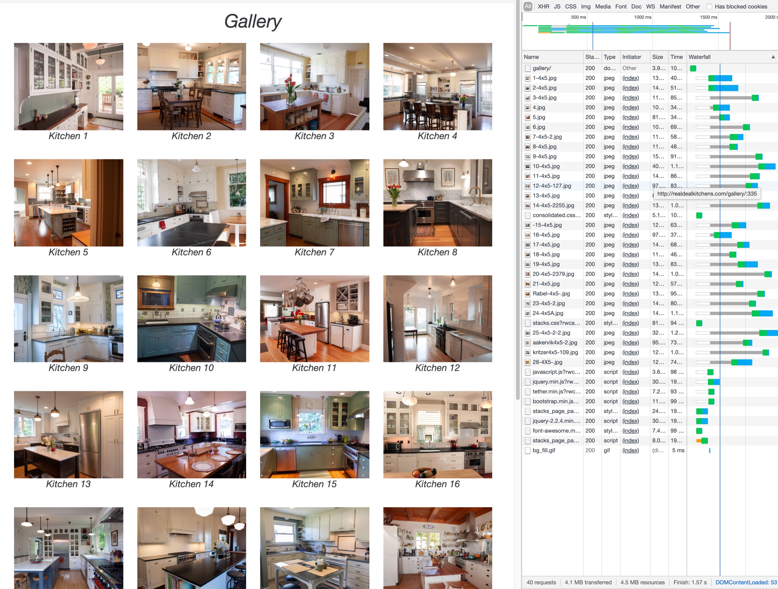
I have a question about optimizing thumbnail sizes for a gallery page of kitchens that my cabinet shop produces. The size of this gallery page is going to grow over time. I am concerned about download speed for this initial page.
One of the good pieces of fortune I have is that my customers are highly motivated and hungry for information. They will endure a little pain if they can get access to knowledge that they want. The first thing I have to do is sell them on the idea that they can get this knowledge from me. Download speed on this first page is the only one I am concerned about.
In other words, I think the quality can be a little lower on Gallery Page if after they click into one kitchen they are rewarded with compelling copy.
I park a SITE IMAGE inside one of Will Woodgate’s LINKBOX Stacks. (I can’t remember if I paid you for this Will, but I am good for it.) There is also an H6 heading with an ID number for the kitchen. I use this combination because it’s real easy for a customer and myself to talk about Kitchen 13 and both find the same information quickly.
I do all of my post processing in Adobe Lightroom. In order to maintain a consistent size graphic in the SITE IMAGES I export one jpeg for each kitchen in a 4X5 Aspect Ratio. This jpeg is then compressed in IMPAGE OPTIM software.
I remember reading somewhere on this forum about exporting first for the size of the image then optimizing second. The drift of this argument was that if the container that was going to hold the image was 300 pixels wide, any extra pixels that are downloaded are going to get thrown away but still need to be transported across the network anyway.
How do I go about determining what the optimum size graphic would be to start with so that I don’t export anymore data than necessary?
Is there some optimum preset in Lightroom that can produce thumbnails for this combination of stacks in RapidWeaver?