Request granted. Stacks 4 will have this feature. 
13 Likes
Fantastic news Isaiah - this will make a huge difference!
It will even allow you to edit the sidebar properties of stacks (as long as they’re the exact same kind) – so if you select a bunch of 2-column stacks, then you can edit their gutter-spacing all together at one time.
it’s pretty awesome, actually.

i’ve had this feature done and been using it for almost a year now. i soooooo want to show everyone. can’t wait can’t wait can’t wait
10 Likes
Which would have been my second most important addition (next to selecting multiples). Great work!
2 Likes
Excellent to hear this, this would definitely be one of the best features to add to Stacks 4 
1 Like
Stacks 4 is all about making everything easier. Smoother workflow. Fewer restrictions. More options to work the way you want to work. And that goes equally for novice users with with simpler and more straightforward text editing, experienced users get multiple selection and partials that can work across projects, and pro users get lots of little details like adding HTML comments and CSS to each stack, disabling publishing of a stack, and even being able to create reusable templates to help clients.
Keep your eyes on all the different forums, my slack channel, and my twitter account if you want to join in helping beta test, or just want some sneak peeks.
Today I’m (finally!!!) letting the long-time stack developers get access to Stacks 4. It’s not quite usable yet (crashes are a bummer – i need to fix a few more) but it’s not far off.
Also…
I want to make sure not to break anyone’s budget, and leave some money left over to buy some awesome 3rd party stacks. So upgrading will still be pretty cheap. $29.95 to upgrade from Stacks 3. Hopefully 30 bucks every few years isn’t too much to ask for a whole bunch of new awesomeness. 
Isaiah
12 Likes
Wow! … I can not wait to see all this! …
RapidWeaver is still a pretty unique application in my opinion. I am not a true expert of this Software, which I use for more than 10 years, but its principle seems to me rather “particular”:
- The Software is based on a standard interface only for macOS and only in English (being French, I would have liked a translated interface, but good! …),
- The Software offers the possibility to buy and thus to enrich its potential with many Themes and other Modules,
- The “Stacks” Module is a central piece and, in my humble opinion, it is the one that gives RapidWeaver all the power,
- And finally, this Module “Stacks” can be enriched with Sub-Modules…
RW is a real Russian doll: synchronize the development of all these different programmers must be a hell! … But hey, the 8.1.6 version works pretty well for the few sites that I still manage today. I hope that the version 4 of “Stacks” will help us in our daily work … And why not make us change our (old) habits by the force of these proposals and new functions? … 
1 Like
Definitely not. There have been significant improvements with each update. I may have missed this, but is Stacks 4 expected some time in 2019?
It’s in private developer beta now. The will be a public beta in about 4 weeks. I’m not sure when the final version will ship – but not long after that.
4 Likes
Just FYI:
The correct terminology is, in that case, plugin
There the terminology is difficult. It was always capital “Stacks” for the plugin itself and lower case “stacks” for the “addons”. It might be “stack addons” or “stack elements”.
Cheers
1 Like
@instacks
Good evening, I suspected that there would be a problem of terminology in my post: yes, I reached my limits in my translation (and especially that of Google) … What does not detract from the complexity RW software … 
2 Likes
@isaiah Never got round to mock ups, too little time this week, but I have one very minor change that I think would help with usability, buttons!
Well button colours to be more exact. I’ve always found it counterintuitive to workout that a pressed button is dark grey, where as the unpressed button is silver/grey. To me it’s more the case that something in a darker colour is not selected/available but something in a lighter colour is the one in use.
Would it be an idea to use the same as RW and have a blue highlight to the icon to indicate when a button is pressed/active? Don’t know if it’s a limitation in RW plugin architecture or something you can’t do anything about, just think it makes more sense and fits in with the overall design of the RW interface too.
I always try to stick to the Apple Human Interface Guidelines for the latest macOS version and use buttons that are fully accessibility-aware (meaning that sight-impaired people can use the software too). This makes for somewhat limited choices in how the buttons look and feel – but makes them fit with the system a bit more. That way folks don’t have to learn anything brand new – they just have to be familiar with using their computer.
Of course there are many exceptions to that rule. There are no bright orange buttons in the HIG, LOL. But I try to save those exceptions for good reasons. I try not to reinvent the wheel too often as it means people have to spend extra time trying to figure out the user interface – I’d rather they spend that brainpower trying to build an awesome website instead.
That said, if you’re using a version of macOS outside of the latest version some things might look “off” – I don’t really try to make the buttons (and other UI chrome) match each version that the app is running in – I just make it match the latest OS.
This will come more into play especially in Stacks 4 as it will include a complete (although very subtle) rework of all the chrome on the buttons, toolbars, etc. Most users probably won’t notice, but I spent quite a bit of time rebuilding all those things so that they’re all blend well with both light-mode and dark-mode in Mojave.
Here’s a couple screenshots of the future UI…
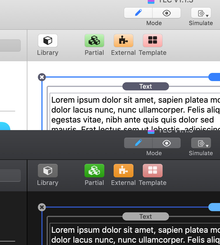
buttons
note that in both light and dark modes the buttons use the same gradients, highlights and shadows as native toolbar buttons (this is not an easy task btw, it took weeks to achieve this). in dark mode the buttons become lighter as you push them, in light mode they become darker. the colored buttons are non-native, but follow the HIG rules regarding colors on the system, they’re pale in light-mode and deep in dark-mode.
close button
the close-button (at the corner of a selected stack) has traditionally been the black circle with an X in the middle – that follows a well-used idiom. for dark mode i just decided i’d invert that and use a light color with dark X in the middle. there’s no idiom to follow there, but there’s some sense in the inversion.
toolbars
note that the toolbars are similar too – but different than – the native window toolbars. they have a subtle gradient to make them appear slightly more curved than the native window. there is no good reason for this – only that it’s nearly impossible to match the native toolbar and blend perfectly – so better to stand out a bit purposefully rather than look close, but not quite the same.
like the native toolbars, they’re vibrant – meaning that they show a hint of color of the content that scrolls beneath them. i’m not exactly a fan of this vibrancy, but it’s what macOS has decided to go with, what RW window chrome uses, and it feels like it would be jarring to be dissimilar.
Stacks v3 (the current version) has spotty uses of vibrancy. that’s because Stacks v3 supports macOS 10.9 – which is before vibrancy was added to the OS. there is no simply way to show vibrancy in some versions and not others – so we had to play some extra tricks – and can only do that in some places.
Stacks v4 has no such limitations so vibrancy will be used in all the places where it would natively appear:
- toolbars show the content underneath them
- source lists (like the narrow vertical library-group bar) show some of the desktop wallpaper color (which seems patently insane to me – but it’s almost impossible to build a source list that doesn’t look that way – so whatever, i’m going with the flow LOL)
- the little library info pane that can go up and down at the bottom of the library sidebar shows colors of stacks that scroll underneath it. i actually kind of like that one.
and all these things have their native light and dark mode variants that match the native controls and backgrounds for Mojave.
In conclusion: There actually isn’t very much left open to decisions like: “how about we make buttons work this other way”. The Human Interface Guidelines are pretty rigid with regards to these things – and building (accessible) controls that work too differently from the standard is actually quite difficult. There are some exceptions (e.g. in the chrome around a partial view, selection boxes, etc.) but by in large I just try to stick with whatever macOS dictates. It tends to make Stacks easier to learn for people just starting out, more consistent with RapidWeaver, and a lot easier to keep bug free.
4 Likes
As far as I know, even developers have to eat once in a while. Perpetual licensing is nothing that fills the fridge unless the growth of the key app is exponential.
Happy to contribute to a happy life of @isaiah as only happy people can make other people happy!
2 Likes
Interesting to hear and see where you are coming from, and going in the future. I suppose for me the system blue was always clearer than the grey. Looking at Apple apps like Pages, the grey selectors are okish at the top of a sidebar menu (not the technically correct term I’m sure but hope you get what I mean) but the buttons further down are all bright blue.

So would it be fair to say that RW8, as far as I can see, doesn’t actually follow Apple’s HIG, as only the icons are highlighted, not the whole button.
Anyway, digressions aside, I’m sure Stacks will be grand and I’m interested to see what the orange button does!
1 Like
ditto. money well-earned and spent.
@pmjd -
short answer
oh my gosh, i totally see what you mean, i’m filing it as a bug now and will see if there is an alternate button type that shows more color. i absolutely think you’re right.
much longer answer
the “system blue” isn’t actually just blue. 
this extra bit of color that’s used to show the selected tabs, and edges of popup menus and dozens of other things is called the Accent Color and you can change it on macOS. in Mojave you can change it separately from the the light/dark mode and the highlight color (the color used to show selected text and list-items). It’s here in the general preferences.

So, yes, you can have purple or lime-green accented controls too! It’s a bit crazy, but it’s kind of fun. I usually keep things set to the gray color on the far right side – not because I like gray, but because it comes with a super secret hidden easter egg of a feature: it eliminates almost all of the “vibrancy” settings of dark mode – so dark gray windows don’t look muddy brown when you have red wallpaper. but enough about that, back to buttons…
The accent color appears on many specific buttons and other control types in macOS. it varies a lot between OS versions tho. so when i drop down a standard popup menu in the Stacks user interface that same control might look quite a bit different over the span of different versions of the OS that you’re running.
Since the Stacks sidebar uses only standard macOS controls – no customization other than icon images – Stacks gets all those accent colors, highlight colors, light and dark mode – and all the different appropriate variants for sight impaired folks, – Stacks gets all that for free. Yeah!
Here is the sidebar of Stacks showing a variety of things that utilize the highlight color. I’ve left it on lime-green so it really stands out (and looks kind of silly if you ask me – but to each their own)

As you can see – when I was annotating this little screenshot I looked at those GRAY BUTTONS and did a  face palm. that’s exactly what you were trying to tell me all along!!!
I thought you meant the toolbar buttons – I hadn’t even thought about these buttons over in the info panel and how they were showing the selection state.
Anyway, I totally get it now. Thanks for being persistent and sticking with me.
I keep all the bug-trackers for my software open to the public – you have to have an account (which reduces spam and trolls) but you can follow along or even post comments or file new bugs. The URL for tracking this bug is here: custom control buttons in the info sidebar should use the system accent color to show the highlight state (#260) · Issues · YourHead / stacks · GitLab
5 Likes
After continuously accidentally double clicking stacks and wrongfully entering the make partial mode. I personally would prefer an edit mode where a user would have a make stack button and edit stack button, preferably in a mode that would force proper naming.
And as time permits, the ability to copy partials between projects (if this is currently not possible)
Because I often accidentally double click and enter the make partial mode, I tend to dis-remember which partial is which and which partials are the ones I need.
My confusion does not mix well with the core functional importance of partials.
Thanks and keep up the good work. Marty
Rt Click Partials
1 Like
You can name them anything you want
1 Like
Hi Martin,
just open projects simultaneously: The one you have the partial in you want to use in the other project and the other project. Then just drag the partial to a (stacks) page in the other project and place it somewhere - voila - the partial will be a partial in the other project.
And with the naming: At the time being naming a partial won’t show on the page after you did it. Only after double-clicking on it again (opening the partial ) and closing it again (clicking “back”) the given name will show on the partial.
Bug is known and should be corrected in the near future.
Happy weaving,
Tom
1 Like