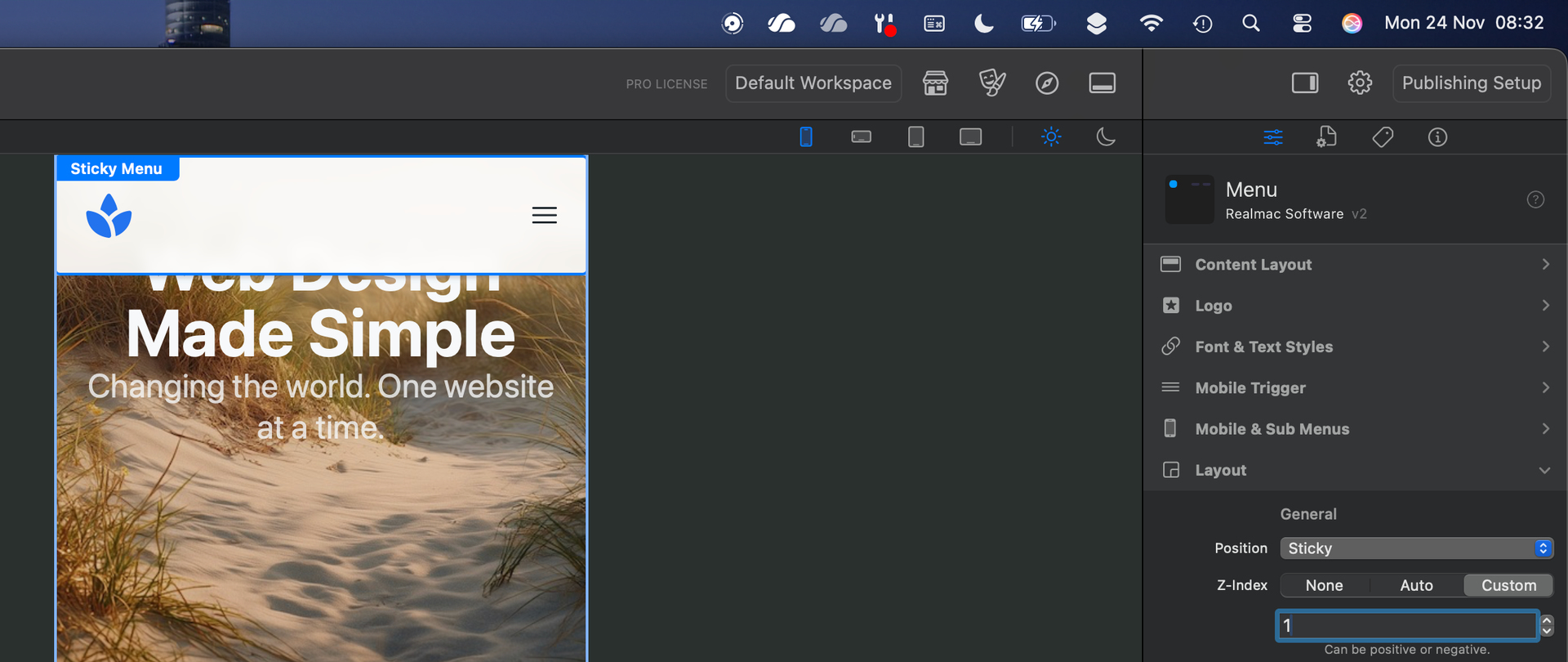
I am having an issue with sticky menus on mobile (iPhone 15 Pro Max). It works fine in portrait orientation but when I flip the phone to landscape and scroll, there is a gap above the sticky menu (see attached screenshot). Any thoughts on what setting I messed up to cause this? 

I think you need to change your Z index to something like -31 give it a try
Changing from 31 to -31 made the menu completely disappear.
Can you show us your layout settings for the menu?
I think Paul meant “31”, not minus 31.

Interesting. I have almost the identical settings on one of my sticky menus (other than the right an left 5 setting) and mine behaves correctly on both portrait and landscape on my iPhone. Try doing a test where all the edges are set to “0” and see if that makes a difference.
Just tried your suggestion and made all 4 sides ‘0’ under both Layout and Mobile & Sub Menus. The menu still moves down slightly creating a gap on my phone in landscape mode. It’s not the end of the world, but would be nice if it wasn’t doing it. Appreciate your help!
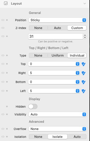
Just following along with the commentary here so I can hopefully learn something from the experts - so can somebody please explain what is the significance of the number 31 in the z-index settings. Paul said to try “something like 31” and Bob said “I already had it at 31” … so I’m scratching my head and wondering why everybody is coming up with 31 and not some other higher number.
Days of the month.
Only joking, I can’t even get my head around what a Z index is.
This should help.
I think the reason this number has come up is because when we first started testing Elements a year ago and we ran into problems with content overlapping the menu, we kept bumping up the Z-index until the content went below the menu. The magic number was 31 when this occurred so now we use that as the minimum for a menu. Of course it can be greater, but if it is less than 31 it will be covered by the content.
Imagine if you had a stack of ten pieces of paper, the piece on the very bottom would have a Z-index of 0, while the one on the very top would have a Z-index of 10. Think of this as the “stacking order”. Moving the pieces of paper below the top one would never cover it as they would be moving below (behind) it. But if you wanted one of the pieces between the bottom and top to now be above the top, the Z-index would have to be increased to at least 11 to always be on top. Most of the time all of this happens automatically and there is no need to worry about it.
So if you have an element that you do not want to be covered by other elements in your layout you would need to ensure that its Z-index was greater than all the others.
The container has a z index of z-30
I noticed the very same issue as the OP last night on my two sites. Content above the menu in landscape mode when scrolling on an iphone. Found this thread while looking for a solution. Was about to start looking at the Z settings when I just checked the sites again, both of them, and the problem is not showing.
After a while it got me wondering whether it has anything to do with dark/light mode on my phone and it does. If my phone is on light mode it looks ok, just a white space above the blackness of the menu. Hover over the picture to get an idea of actual screen shot size.
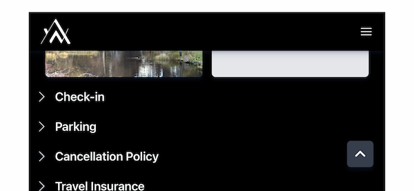
If it is on dark mode the page shows through what is white space in light mode -

I have read about dark and light modes in Elements and I have not touched them. Like CMS, it is all the devils work which I was hoping to avoid but is the solution in there? The Z index for the menu was set at 1. Changed it to 31 and it made no difference.
I could just turn off dark mode on my phone which is probably the easiest solution but now I know about it I would like to fix it.
attach your project or even just a new with headers on and I will look for you


@AstraeaMarketing please share your project via Elements Cloud so we can inspect it and resolve the issue for you. It’s almost certainly a z-index problem that happens when sticky elements overlap other content.
Bob at Astrea may have solved his problem so here’s mine.
Have stripped it down, published site is here - https://www.test.blackrockq.com/
elementsapp://downloadDocument/pMLUHXWtdAha
Problem is as per post above Paul’s. Issue only shows in landscape mode on iphone when phone is set to dark mode.
Cheers for the tips Paul.