In my blog the impact stack at the top of the page as well as on each of the article’s pages is showing well.
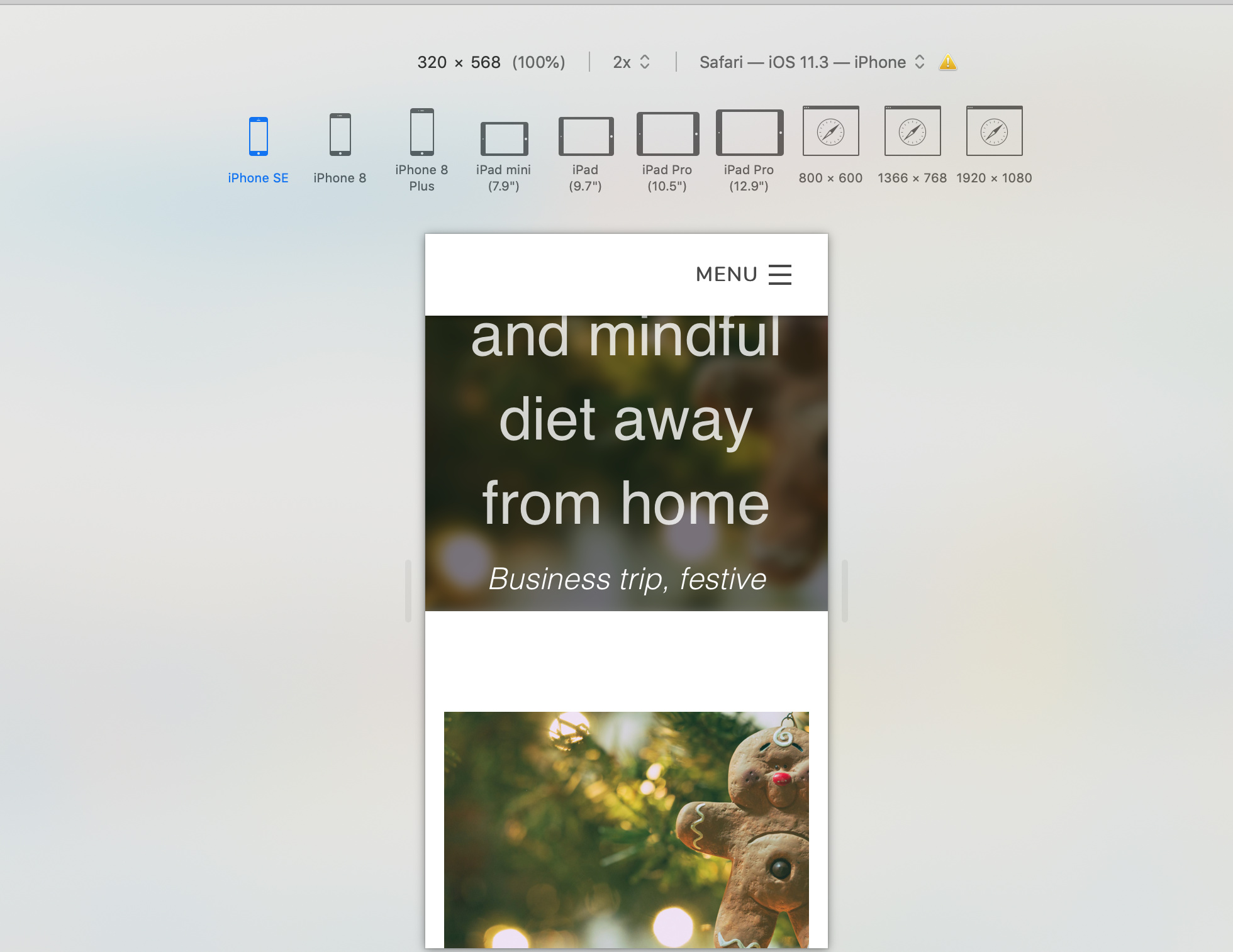
The issue is when a see the page on a mobile screen mode: this is how it shows.
I tried to decrease the font size for mobile, but it looks like the 1rem is the minimum
I tried to click the “Thumb on Mobile?” setting, but nothing changed on mobile settings. Although I haven’t published it, so maybe it is a requirement to see the change
I played with the container size settings, but without achieving the goal of fitting the entire text and title on the mobile’s picture.
I did manage to fit the text almost entirely on mobile, but it showed so small on dekstop and tablet screens.
What do you suggest?
Any idea on how to fix this would be highly appreciated.
Sorry that I missed this one. Looks like there are a lot of broken images. I hope that @ben can help fix this… it will make it easier for me to understand the issue.
Although in my opinion on deckstop now, the impact slide may be a little bit over the edge in terms of size! The picture is literally… massive . I published the changes anyway because better massive than regular, but not visible on mobile: have a look at it, what do you think?.
See previous… I set minim height at 850px… I think I could have had the best of both worlds if the flexible height setting could have been set to 150% or so.
Do you think we could optimise this aesthetic issue somehow?
Thank you so much anyway. At least now, it is all readable.
It would look much better if we can find a solution on how to reduce the font sizes inside the container instead of enlarging so much the impact banner…
Ah, sorry I didn’t catch that part. SO the custom font size setting isn’t working in the foreground content when it’s set to Hipwig as the content type?
I’ll try to test later today as well.
Also I tried to adjust the rem sizing inside the stack settings and this is where it gets interesting…
When I click on the font sizing inside the Stack settings: 1.00rem shows up on both devices. And voilà the text is now showing in full on a mobile device (not the Iphone SE though…still not fitting entirely)!.
What could I do next?. Why is the tablet sizing inside the Stack settings not working?. I am sure we will sort this out soon!. The “dragon” is getting tired and we are keeping strong


 . I published the changes anyway because better massive than regular, but not visible on mobile: have a look at it, what do you think?.
 Thank you so much anyway. At least now, it is all readable.


