the devil is in the details:
- the type of image
- the type of color in the image
- if the image has a color profile embedded
- the type of color profile that is embedded
- whether your monitor supports the color profile
- the calibration settings of your monitor
- if the specific color is in-gamut for the monitor
- whether the browser (or web view) supports color profiles for that image type
- whether there was dithering added to the image
- whether the image is being transformed (usually scaled) by your video card
- whether the image is compressed
- platform
- hardware
you started with an sRGB image but just specifying RGB values will get you only a plain vanilla RGB color. the gamuts of those two color profiles overlap by something like 98% – but there are a few colors that don’t map directly.
but more than likely it’s just because the image was saved with a color profile. that means that (so long as the web browser supports it – chrome doesn’t support color profiles for jpeg) then the image colors will be adjusted so that they appear on the user’s monitor much the same way they did on the monitor of the person that saved that file.
but the color picker always just picks up the end-result – the color that you actually see on the screen. which is why if you display the color 128,128,128 in a web browser (depending on calibration settings) you won’t even color-pick that value.
i should also mention that all this stuff varies VASTLY between platforms – and even within a platform depending on hardware. did i mention that a bunch of iOS devices have something called “deep color” – yeah – that too. this stuff is complicated.
let’s just take one simple contrived example…
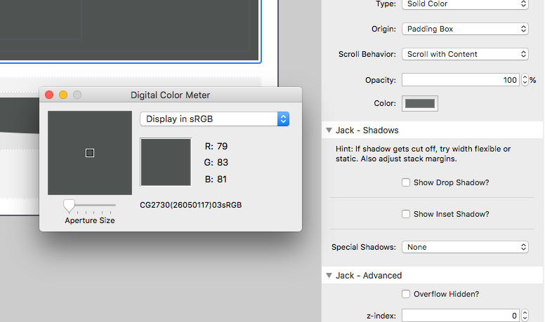
so let’s say the color in question is 128, 128, 128
the guy who saved the file had a monitor that is calibrated to +1, 0, 0
and you have a display that shifts things -2, +1, 0
then the color in a png in safari, so long as it was saved with an embedded profile will display as 128+1-2, 128+0+1, 128+0+0 = 127, 129, 128
but if you select the color 128, 128, 128 and then display it via your mac – it doesn’t have that profile from the other monitor, so it’s going to display with only the offsets of your monitor calibration: 126, 129, 128
even if you start and end of the same display things can still get strange. and even if you don’t embed color profiles things can still get strange – dithering, video card scaling, 8-bit depth smashing, … and probably a half dozen other things that i don’t know about. believe it or not, even though it seems like i have a lot of info about this in my head, i have only learned the minimum necessary to build mac apps. for a real expert on the subject i’d recommend following @marcedwards on twitter.
BTW: the apple color picker is pluggable (you can install more panes) – and i think there are a few out there that let you sample pre/post calibration.
but for my own purposes, i just know:
- it is very difficult if not impossible to match an image color to a specified color in a CSS style. the exceptions to this are GIF and SVG which use raw 8-bit color, just like a web page.
- sampling colors has so many strange behaviors that i always treat color pickers as approximates rather than an absolutes.
update: one more thing… i don’t currently know of any bugs in the color system for stacks – either in API specified colors, or the way it displays, exports, converts, or transforms images. but there have been bugs in the past – especially in the API. if you notice something that seems like it might be a bug let me know – but please please please know that you’re in for a serious interrogation about the details – because as i think i’ve made pretty clear – the details here make all the difference.