cwall64
October 28, 2025, 12:28am
1
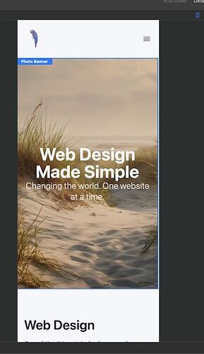
I have started mocking up a site with Elements and I noticed the display on the iPhone Pro (few years old) is not like the look of the smallest size view in the designer. I looked and before I started messing with it the image was set to center. I’ll include the two images.
Designer:
iPhone screenshot:
Where should I look to correct this?
Ulrich
October 28, 2025, 9:35am
2
Maybe this is because the default Content Layout Width of a Container is Breakpoint. (I hate this default, it should be Full).
Try to move the right side in the designer and watch if somethin is jumping…
Also look at the size of the menu. Set the menu to hidden to see if it is the menu.
dan
October 28, 2025, 9:49am
4
It’s usually because you have a component on the page set to a specific width that’s forcing the browser to display wider.
Scroll down on the iPhone to find the item with a fixed width…
If you can’t find it, you can share the project via Elements Cloud and paste the link here and we’ll locate the issue on the page for you.
cwall64
October 28, 2025, 6:49pm
5
Much appreciated all, it was the footer, so I made the whole container hidden at the smallest size.


