Hi @refsvik
Thanks for taking the time to write such detailed feedback, we really appreciate it ![]()
You win the award for most panels open at once! ![]() Seriously though, it’s great to see the panels feature being used like this, it’s exactly why we built it.
Seriously though, it’s great to see the panels feature being used like this, it’s exactly why we built it.
You can absolutely do that. The best approach is to start with your page in light mode as any styling changes made here apply to light mode.
Then, toggle to dark mode and apply any overrides you want. That way, each section can have tailored styling for each mode. This gives you complete flexibility and contrast control.
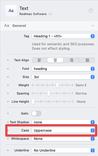
You can control text casing in the Typography section of the Text controls. Look for the setting labeled “Transform” — that’s where you can switch to uppercase.
We use Tailwind terminology to keep things consistent with the underlying design system, which can take a bit of getting used to, but it’s very powerful once you’re familiar with it.
We have chosen to keep the component control naming closely linked to the underlying Tailwind name as this keeps things consistent when referring to the underlying CSS.
The workspaces don’t automatically change when switching monitors, but you can save different configurations and manually switch between them as needed. Dan walks through this in Dev Diary #56.
You can do this by adding a custom robots.txt file to the root of your project. That gives you full control over how search engines index your site.
That’s exciting to hear! It’s a great approach to begin with the design and structure first. That said, I do want to set expectations: the first version of the CMS will focus on core features and editing within Elements itself. We’ll expand on it over time with features like online editing and more advanced data handling.
Dan covers this exact setup in this video, where he walks through how to create grids with uneven columns using Tailwind utilities. Definitely worth a watch!
A List component is definitely on our roadmap, however, it just relies on a couple of other features being in place first to ensure it’s flexible and future-proof. In the meantime, I created a custom list component you can use right away. There’s also a short video included showing how it works.
We’d love to take a closer look. Could you share your project with us via Elements Cloud, that would be a big help. Performance is very important to us, and we want to make sure things stay fast and reliable, even on large projects.
That’s totally fair, especially if you’re coming from a different platform like WordPress. The good news is that Elements gives you full access to modern web design tools (like Tailwind CSS) in a visual way. It’s a bit of a learning curve at first, but once things click, you’ll find yourself working much faster and with more flexibility than ever before.
We’ve got loads of videos on our YouTube channel, and we’re always happy to answer questions directly if you ever get stuck.
Thanks again for the thoughtful post, we’re really excited to have you building with Elements! ![]() Let us know if there’s anything we can help with as you continue building your site(s).
Let us know if there’s anything we can help with as you continue building your site(s).
