When a 2 columns stack, with setting 7 or higher for both columns, is shown on mobile, the columns are stacked (vertically) with the former left column coming first, above the former right column. Is it possible to change this order? Thus, that the right column comes first, above the left column?
Which column stacks are you using?
Hi Paul, I work with RW8 and Foundation 6. My “problem” is that in a medium or large screen I want to see a picture/photo on the left side and the accompanying text on the right. On a vertical/portrait screen on a mobile, I’d like to see the text first and the photo underneath. I wonder if and how this is possible.
I’m not familiar with F6, although I am with F1 and it had the option to switch which col was on the top when they stacked. Although from memory it wasn’t the most user-friendly way of doing it. I suspect F6 has the same feature, although it might be a bit buried in the settings.
If it’s only two columns you want to work with, @tav has the best option for this sort of thing in the shape of Sidebar, which is part of the Blueprint suites of stacks.
Sidebar is a super simple but highly manageable two column stack that gives you loads of options.
It breaks the columns down into names: Main and Aside, think of these as col 1 and col 2. You can then dictate how they behave above and below a specified screen size.

IIRC with the original Foundation the trick with something like this is to design for mobile first with your text first and photo underneath. Then use the ‘push’ and ‘pull’ features to re-order the columns at your breakpoints. I spent ages trying to do this the other way around - designing for the desktop and then trying to manipulate the columns for mobile and it wouldn’t work.
So, try mobile first.
Rob
I’m just starting to use F6 myself, so not an expert answer but found that unlike F1 column stacks which could be source ordered so you could get the layout you are after F6 doesn’t seem to have this in the standard column stacks.
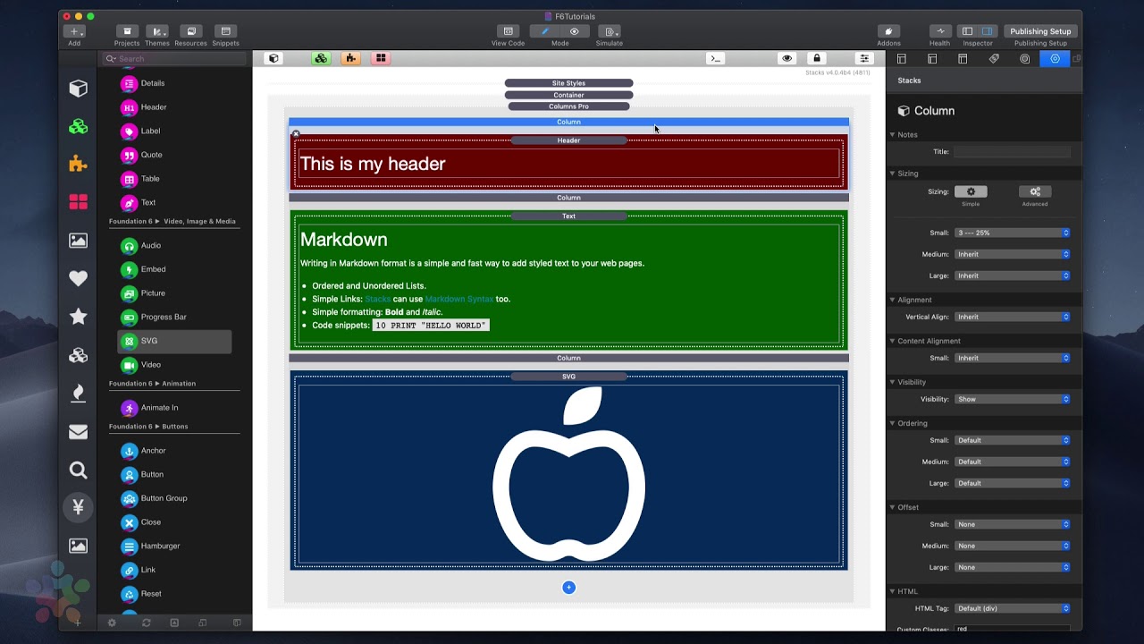
Instead try the Column Pro stack in F6. Add two columns, put the picture/photo in the first column, the accompanying text in the second column.
In the Ordering section set the first column with the picture/photo to 2 in the Small setting, and 1 for Medium and Large. Set the column with the text to 1 in the Small setting and 2 in the Medium and Large settings.
That should work.
About the only thing in common between Foundation 1 and Foundation 6 is the word Foundation.
It was a total rewrite and intentionally removed all these options along with the weight they produced.
Column Pro is the only way to swap orders. There is a F6 template called Column Swap in the free template pack if you want to see an example.
Also a video here
Thank you all. It worked as Paul and Doug advised. Next little problem is to match the height of the columns… It didn’t work with Match Height… So how can I have the same height responsively? I can manage for larger screens (with a swatch), but on landscape mobiles and some medium screens the columns (next to each other, that’s OK) have different heights. Sorry, I am still a novice… 
OK, thanks again, I will try to do this tomorrow (here in The Netherlands it is 00:30). I’ll let you know if it works on all screen sizes and in portrait as wel as landscape mode.
Do you have the free template pack for Foundation 6? There is a Column Swap template that does exactly what you are looking for.
You can get the template pack on the product page.
Hi all,
It worked with Columns Pro. Columns Swab didn’t work like I want… For now it is OK.
… except that the column with the picture will get space around the picture, when the column of the text is larger. If I set the picture to fill the container, then it will be enlarged, but therefore cut off at the side. All logical. So I have to deal with the text column, or accept the space around the picture.
Maybe play around with the column sizings at each breakpoint to get the right balance for each view?
Yes I have to do that, Paul. But you name another thing I am struggling with: the breakpoints. Is there any overview of common breakpoints, or a table with dimensions of the most used screens, or something like that? It would help to set the BP’s for the stacks.
This might help with BP sizes
Thanks very much Doug, this will help!
The breakpoints themselves are already set in F6, though I think they can be overridden with the optional swatch pack. The only option you have is how your content looks at each breakpoint.
What is very useful is in RW preview screen there is a small tick box down the bottom left of the screen for “Manual Adjustment”. This allows you to grab the side of your site and watch in real time how the content and layout change as you change the width.
It’s great for finding where your content may end up looking rather odd, rather than going with the inbuilt assumptions of only having iPhone and iPad screen layouts.
The breakpoints are set in Foundation. I wish that I could allow you to customize them, however, that is just not possible. Columns Pro does have an advanced sizing option though that allows you to break columns at a custom defined breakpoint.
This topic was automatically closed 30 days after the last reply. New replies are no longer allowed.

