I’ve spent hours today trying to do a simple task but have failed miserably. Can anyone help please?
I have a very simple straightforward website mostly using Photo Album pages. Now I want to create a Styled Text page which will contain lots of garden photos (various shapes and sizes) plus a small bit of text either alongside or wrapped around some of the images. I’m dragging the images in from my desktop but just don’t seem to be able to position the photos where I want them to make a pleasing arrangement and to make sense of the text that refers to them.
My old website was created using RW6 and I was quite happy with the way the garden page looked but I am using a different theme now and I thought I could simply copy and paste the entire page (text and photos) into my latest one in RW7 but it doesn’t look good - the photos are all over the place with photos either butted up against other photos or lots of blank white spaces in between. I know how to set the text to wrap around the photos by doing FORMAT, HTML, ALIGN to LEFT or RIGHT so I don’t think that’s the problem - there’s obviously something else that I need to do.
First, it’s almost impossible to help without a URL and knowing what theme you are using.
Also, if your site was in RW6 you should be ale to just update it to RW 7 ( make sure you have a good backup) then, just switch themes. You may need to tweak a few things but you shouldn’t have to start from scratch and cut and past everything in.
If you can give some more info, I’m sure you will get some help.
Thanks for taking time to offer help. The theme is LANDERS. I chose that theme simply because I wanted a long banner image at the top of each page. I also wanted a clean and simple website that I can update most weeks without getting into any coding etc as it tends to go way over my head.
When you say I should show the URL, do you mean my published website address (www.marydavidson.co.uk) or do you mean I can somehow post a link to show the unpublished Styled Text page I’m trying to create?
The reason I didn’t just have a straightforward switch from RW6 to RW7 was my own fault for not keeping all the website photos together in a folder outwith the photos application. I had read it was a good idea but I stupidly didn’t do it - they were all in iPhoto and all the RW6 photo album pages were linked to my iPhoto albums.
When I switched to Apple’s new Photo application I also upgraded to RW7 at the same time so, although all the text on the pages was still there there were no photos - which was not good as my website is mostly about photos.
I have since created and published a brand new website in RW7 - but I still have the “Garden” page to do and that is a mix of text and photos so I thought to use a Styled Text page but am struggling to do a simple task … drag the photos in and place them where I want them. They just seem to be randomly all over the place.
Sorry that was so long-winded. Hope it makes sense and someone can point me in the right direction.
By URL I was refering to the page you are having issues with. Seems you haven’t published it yet.
A styled text page is just that, it has a “floating” structure. The images and text will reflow according to the browser screen size. If you want a more structured look then you will need to do it differently. A Stacks Page would give you the most options.
I didn’t see a garden page on the url you provided so I’m not 100% sure what you are after. Do you happen to have an example of what you are after?
Thanks Scott. I’ve taken some screenshots of the garden page on my old website - bear with me while I resize them and attach them here. (Hope this works!) …
That’s how the old website garden page looked. I created it using a Styled Text page. It was quite easy but now I just can’t get the photos so sit like that. I don’t know what I’m doing wrong this time.
What I am saying is that on a responsive site, things are going to move to accommodate the screen size.
That means as the screen gets smaller, a photo that was beside a paragraph may end up above /below a paragraph. As the screen gets larger a paragraph that was 6 lines may become 2 or 3 (and things below will move up).
Why don’t you publish the new garden page (you can un-tick Show in Navigation in the page inspector until you get it the way you want) then you can be more specific about the problem(s) and we can see what’s going on.
I’ve published my website with the new GARDEN page and as you suggested I’ve not shown it in the navigation menu - I hope you can still access it. What you see is how it looked when I copied and pasted it from my old site in RW6 over to RW7. All the photos are huge and spread right across the page whereas in the old site (which wasn’t perfect but I was happy with the garden page) they appeared smaller and neatly grouped with the text either below or in little paragraphs alongside. When I look at the garden page now on the new site it looks fine in Edit mode. I’m trying to get it looking a bit like a magazine - lots of pics but just a small amount of text to explain a bit about the garden. I’ve tried double clicking them to display the image information and reducing the percentage plus to get the text to wrap I align them left or right in the Format HTML tab but when I view them in Preview they are still huge and pixelated.
All my other pages have a Sidebar but I didn’t want one on the garden page so earlier this week someone here on the Forum gave me this code which successfully removed the Sidebar completely from this page …
I still hope I can create this page using a STYLED TEXT page as I did think it would be the easier option.
Thanks again for the time you’ve spent looking at this for me.
Mary
PS - (I’ve checked my old website and no it wasn’t responsive - (I hadn’t realised that) - all the photos and text stayed exactly the same, only the grey margins moved in and out. When I preview it for iPhone it looks terrible, only half the page can be seen vertically!)
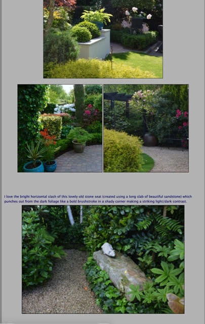
Meant to include this screenshot … this was another version of the old site that I created in STYLED TEXT. The photos are much smaller but I’d be more than happy if my new page looked as clean and easy to read as this. I’m feeling so dumb as I just can’t figure out how to do it.
Hi Robert - thanks for your help re the Sidebar. I did try unchecking the Use Master Style box before I sought help on the forum, but I came up against a problem. I only wanted to remove the sidebar on that one page, I needed a sidebar on all the other pages, and unchecking that box seemed to affect the whole site.
I entered that bit of code on that one page only and like magic the sidebar disappeared!
First. on a Styled text page in order to place photos left/right of text you do the following:
Drag an image in and size it if necessary.
Add your text right after the image. do not put any spaces or carriage returns in between the text and image.
Select the photo by clicking on it. go to menu: Format >HTML> Align Image Left/Right. Note:* you won’t see any visible sign of change except a slight green highlight around the image which indicates HTML has been applied.
Images will go in the center by default so if thats what you want, do not apply HTML just hit return and continue on.
If you want 2 or 3 images on the same line just drag them in one after another.
Now, go to preview and you should see the results.
It’s not exactly intuitive on a Styled Text page because you can’t really see what’s going on until you preview. This type of thing is much, much easier using Stacks.
Treat each piece of text/image combo as a “section” put them in one at a time, then format with HTML and preview. Then do the next section. Add a carriage return after the text to get white space between sections…
I would delete everything off of the page and follow the above procedure.
Don’t worry about margins or padding around the edges or around the photos, you can easily add a little CSS after the fact to deal with that page wide.
Scott that is all very helpful, thanks so much for taking the time to type all that out.
I think you’re right, deleting the whole page and starting again sounds like a good idea - think I was just trying to cut corners by copying and pasting from the old site
I will get back to it again once I finish in the studio.
I’ve spent ages this morning trying to get the garden page to look the way I’d like it - I definitely have a bit more control over the way the page looks but it’s been about 3 hours now and I haven’t got passed the first 4 photos! I think this is going to be too time-consuming for me.
You say this style of page is much, much easier using Stacks … I’m now very interested. I’ve had a quick look through the Stacks page and realise there are hundreds … I’ll need to work out which one would suit what I’m trying to do.
For the look of your page, you can easily use a 2 column stack with a text stack on one side and an image stack on the other side. Very simple to do and you should get your layout done much faster.
Good morning Mary,
Rob @zeebe is right on the money, for a simple page like that you could just use the standard stacks that are included with the Stacks Plugin. (2 column, image, text)
But once you install the Stacks Plugin there are hundreds of stacks available that make practically any design you can imagine possible.
Rob @zeebe and @swilliam (Robert and Scott) thanks to both of you. This afternoon I started looking at Stacks and have now watched tons of Joe Workman videos on YouTube … think my brain is about to implode!
So do I simply go to Yourhead.com, purchase the Plugin then choose a design that will allow me to create my garden page?